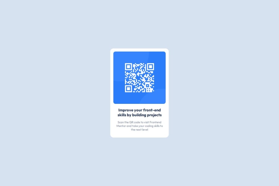
Design comparison
SolutionDesign
Solution retrospective
What are you most proud of, and what would you do differently next time?
I improved my old code of this
What challenges did you encounter, and how did you overcome them?How to center a div, Center div in a div By googling them and relearning past learned concepts
What specific areas of your project would you like help with?not sure, since i updated it with knowledge i gained over time
Community feedback
- @mkhantkPosted 12 months ago
how about
img {
  width: 300px;
}
that should shrink the QR code altogether with the text under it. I'm not an expert, so this is just my humble opinion. You're welcome.
0
Please log in to post a comment
Log in with GitHubJoin our Discord community
Join thousands of Frontend Mentor community members taking the challenges, sharing resources, helping each other, and chatting about all things front-end!
Join our Discord
