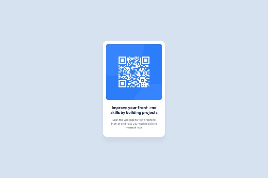
Design comparison
Solution retrospective
Not much to write here
What challenges did you encounter, and how did you overcome them?Learning how the style guide needs to be read to understand it. Learning spacing in the Figma design file.
What specific areas of your project would you like help with?I would like to know if targeting the body for background color was correct or should I have made a container and wrapped my HTML in that container.
How can I improve my class naming.
Is there a way to streamline my CSS? (I kept the styles in the style tag intentionally)
Community feedback
- @AdrianoEscarabotePosted 5 months ago
Hey Michaeldremy, how’s it going? I was really impressed with your project’s result, though I have some advice that could be helpful:
Consider using
remfor font sizes. When font sizes are set in absolute units like pixels, users can't adjust the text size based on their preferences. Relative units likeremadapt to the screen size and user settings, making them more flexible across various devices.If you'd rather keep using
px, you can download a handy VS Code extension that converts pixels toremautomaticallylink -> px to rem Everything else looks great.
Hope this helps! 👍
0
Please log in to post a comment
Log in with GitHubJoin our Discord community
Join thousands of Frontend Mentor community members taking the challenges, sharing resources, helping each other, and chatting about all things front-end!
Join our Discord
