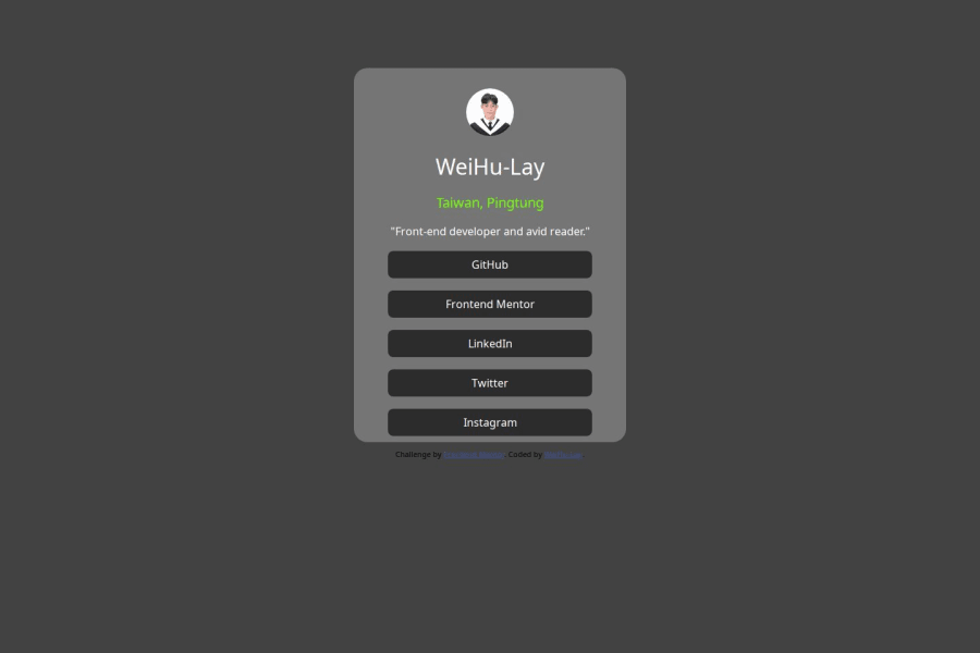
Design comparison
Solution retrospective
首先使用Figma來設計頁面格式還有顏色、排版,完成之後就依照Figma上面的格式製作,由於有了Figma的幫助,很快就完成了這題!
First, use Figma to design the page format, color, and layout. After completion, follow the format on Figma. Thanks to the help of Figma, this question was completed quickly!
What challenges did you encounter, and how did you overcome them?這一題基本上沒有遇到甚麼挑戰,更像是讓你熟悉HTML的元件排版、使用和CSS的熟悉程度!
This question basically does not pose any challenges, it is more about making you familiar with the layout and use of HTML components and the familiarity with CSS!
What specific areas of your project would you like help with?因為我的排版很粗糙,幾乎都是一個div一個元件,然後css也擠在一團,但是這是我最盡力之後的成品!希望可以跟各位多多指教!
Because my layout is very rough, almost one div and one element, and the css is also crowded together, but this is the finished product after my best efforts! I hope I can give you some advice!
Community feedback
Please log in to post a comment
Log in with GitHubJoin our Discord community
Join thousands of Frontend Mentor community members taking the challenges, sharing resources, helping each other, and chatting about all things front-end!
Join our Discord
