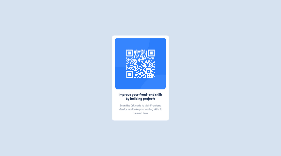
Design comparison
Solution retrospective
In this project, I had problem with the image's border radius although I made it the same as expected, but the border-bottom-left and border-bottom-right were getting extra range. Any recommendation regarding to the project would be appreciated, plus I have started Java script but I do not know how to go on except from (w3schools) can you recommend me any other fun and useful source? Thanks!
Community feedback
- @EileenpkPosted over 1 year ago
Hi Tamana! your project looks great, and this might be a helpful tip.
One change to think about is formatting your code with proper code indentation and line breaks. For this project, it doesn't matter as much but it definitely will once you start on bigger projects. It really makes it much easier to read/review/debug/reference the code. I would add the Prettier extension to Vs code if that is the IDE that you are using.
Here is what the formatted HTML should look like.
<!DOCTYPE html> <html lang="en"> <head> <meta charset="UTF-8" /> <meta name="viewport" content="width=device-width, initial-scale=1.0" /> <link rel="icon" type="image/png" sizes="32x32" href="./images/favicon-32x32.png" /> <title>Frontend Mentor | QR code component</title> <link rel="stylesheet" href="style.QR.css" /> </head> <body> <main> <article class="container"> <img src="./images/image-qr-code.png" alt="" class="img-1" /> <div class="content"> <p class="first"> Improve your front-end skills by building projects </p> <p class="second"> Scan the QR code to visit Frontend Mentor and take your coding skills to the next level </p> </div> </article> </main> </body> </html>
Also, look into Scrimba if you want to learn JavaScript, it's free and a great way to actually get practice and you have help if you need it.
Here is a link to their free courses
- https://scrimba.com/allcourses?price=free
Hope you found this helpful!
- Let's connect on LinkedIn! - @Eileenpk
0 - @Finney06Posted over 1 year ago
Hello there 👋. Good job on completing the challenge !
Here are some suggestions regarding your code that may be of interest to you.
HTML 🔤:
To clear the Accessibility report:
Use an
h1
tag for the main text in the design given and always avoid skipping heading levels; Starting with<h1>
and working your way down the heading levels (<h2>
,<h3>
, etc.) helps ensure that your document has a clear and consistent hierarchy.I hope you find it helpful!😏 Above all, the solution you submitted is 👌. 🎉Happy coding!
0 - @lucaliebenbergPosted over 1 year ago
Congrats on completing the challenge!
Wes Bos has some good practice exercises on JavaScript, and so does JSChallenger:
https://www.jschallenger.com https://javascript30.com/?ref=steemhunt
I hope I could help you. Happy Coding!
0 - @namborghiniiPosted over 1 year ago
Good job on completing the challenge!
Instead of
border-radius: 1.5rem 1.5rem 1.5rem 1.5rem;
you can just writeborder-radrius: 1.5rem;
and it will be valid for all corner.If you want to practice your JS Skills (or other languages) you should definetely check out codewars.com :))
I hope I could help you. Happy Coding!
0
Please log in to post a comment
Log in with GitHubJoin our Discord community
Join thousands of Frontend Mentor community members taking the challenges, sharing resources, helping each other, and chatting about all things front-end!
Join our Discord