

Design comparison
SolutionDesign

Solution retrospective
Hi! I used this challenge to return back to learning coding after a period of not doing it.
Some things I had trouble with, but would like some feedback on:
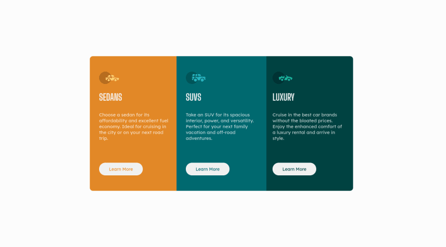
- The rounded corners thing. Couldn't get it to work on the container, so I put them on the individual cards and played with negative margins. Must be a better way to do this I think? Any suggestions?
- The rounded corners - but vertical. Due to the margins applied on the desktop view, the two bottom cards where slightly shifted to the left. Tried to overrule this with @media, but didn't really work. So I put negative margins on all cards and compensated it with 10px padding in the @media.
Thanks in advance for feedback!
Community feedback
Please log in to post a comment
Log in with GitHubJoin our Discord community
Join thousands of Frontend Mentor community members taking the challenges, sharing resources, helping each other, and chatting about all things front-end!
Join our Discord