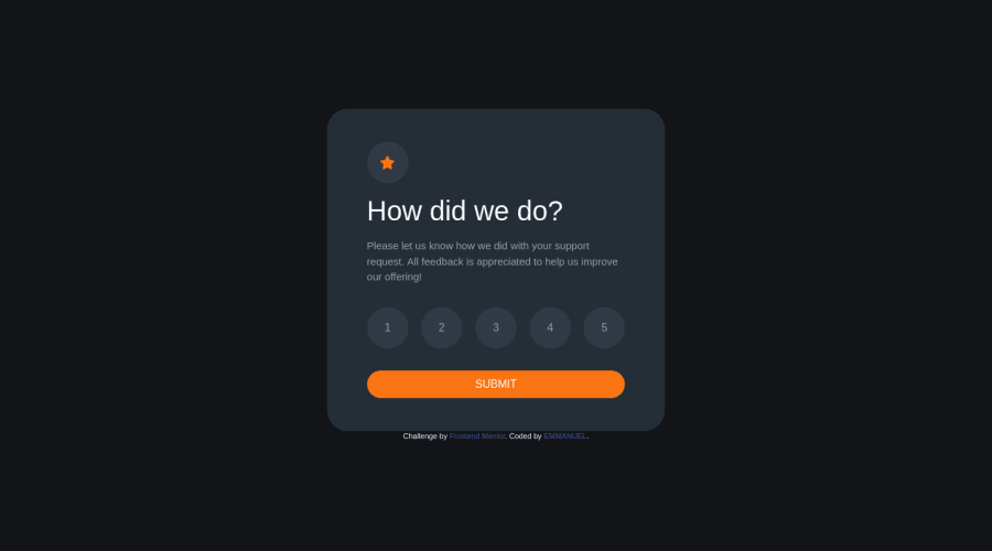
Design comparison
Solution retrospective
What do you think of my design and the way the javascript was used,is this a good practice?
Community feedback
- @correlucasPosted over 2 years ago
👾Hello @Damilarr, Congratulations on completing this challenge!
One tip about responsiveness:
To improve the card overall responsibility, you can start to add
flex-wrapinside the class that manages the section for therating numbers buttonand makes the adjust to fit in different rows while the container scales down, not that without this property the container doesn't shrink. Here's the code applying these changes:.d-flex { flex-wrap: wrap; display: -ms-flexbox!important; display: flex!important; }✌️ I hope this helps you and happy coding!
Marked as helpful0 - @hyrongennikePosted over 2 years ago
Hi @Damilarr,
Congrats on completing the challenge
Instead of the browser alert box which is bad for user experience, I would suggest just disabling the button until a rating is selected this can be done by adding the disabled attribute on the button and removing it when the rating is clicked
Hope this is helpful
Marked as helpful0 - @faha1999Posted over 2 years ago
Hello, Damilarr Congratulations on finishing this project. It's lovely and great on the whole! Just a little tip:
- You might want to use semantic tags like the
<main>to wrap your code, instead ofdiv. like
<main class="bdy d-flex justify-content-center align-items-center flex-column">
</main>
You could also make use of
<section>and/or<article>semantic tags. This would help improve accessibility.I hope it will work. Happy coding.
Marked as helpful0 - You might want to use semantic tags like the
Please log in to post a comment
Log in with GitHubJoin our Discord community
Join thousands of Frontend Mentor community members taking the challenges, sharing resources, helping each other, and chatting about all things front-end!
Join our Discord
