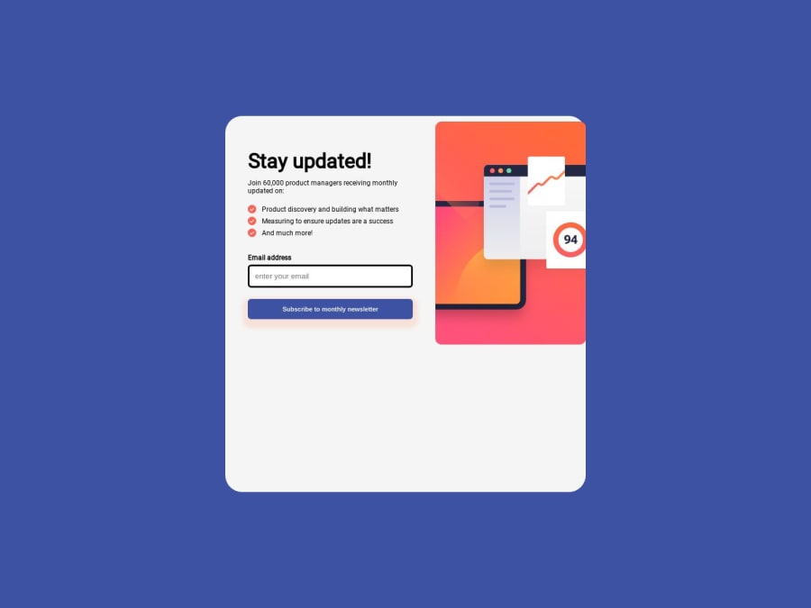
Design comparison
SolutionDesign
Community feedback
- @bedofaresPosted about 1 year ago
Good job ! I see that you have the padding-right & left as 0 which I guess if you set it to 10px same as for the top and bottom padding it will look nicer, you can also play around with the padding until you see it looks good.
I would suggest removing the padding from the .part-left on the mobile screen and increasing the width to 95% it will also look way better aligned.
like this :
@media screen and (max-width: 639px)
.part-left {
    width: 95%;
    padding: 0 0;
}
Marked as helpful0
Please log in to post a comment
Log in with GitHubJoin our Discord community
Join thousands of Frontend Mentor community members taking the challenges, sharing resources, helping each other, and chatting about all things front-end!
Join our Discord
