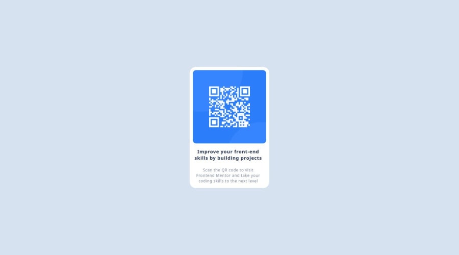
Design comparison
Solution retrospective
I'm proud to be part of Frontend Mentor Community. This is my first time trying a challenge like this . Hoping to learn a lot from the family. The project was a little bit challenging but I try my best.
What challenges did you encounter, and how did you overcome them?I was finding it difficult to assign width and height to the container or box in which the content are
What specific areas of your project would you like help with?Responsive design
Community feedback
- @hilmi77Posted about 1 year ago
Hello @ISAAC EDZORDZI FIAVOR!
Your Solution looks good🎉
when I review your solution
I have some advice for you
-->If you are a Free member of FEM your starter file doesn't include Figma design therefore you can use Perfect pixel extension which usage so simple
--->By using this extension, you can see the size of your designs more clearly while working.
if you find useful this comment please click "Marked as helpful"
Happy coding
0 - P@DamilordzPosted about 1 year ago
Positive Aspects: Clean Code Structure: The use of CSS variables and global styles demonstrates good organization and maintainability. Responsive Design: The component appears to be responsive, adapting well to different screen sizes. Clear Call-to-Action: The message inviting users to improve their front-end skills is clear and concise.
Areas for Improvement: Accessibility: Consider adding alt attributes to the <img> tags for better accessibility, especially for users with screen readers.
The solution demonstrates a good understanding of CSS styling and layout techniques. With some adjustments to typography, spacing, and accessibility, the component can be further improved to provide a better user experience.
0
Please log in to post a comment
Log in with GitHubJoin our Discord community
Join thousands of Frontend Mentor community members taking the challenges, sharing resources, helping each other, and chatting about all things front-end!
Join our Discord
