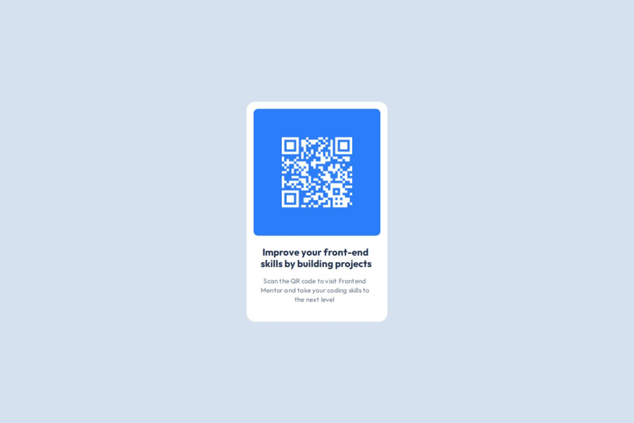
Design comparison
Community feedback
- @Alex4421Posted about 2 months ago
Thank you very much for checking and evaluating my work, I will take it into account. How can I solve the problem mentioned in point 1?
0 - @uheronPosted about 2 months ago
Your solution is identical to the designs. Great job!
Two things would be good to improve:
-
Since you removed all default styles from the browser, your image is not actually centered as a person opens the page. If I scroll down a little, then it is centered. In real life, it can cause possible issues. For example, if you have a button at the bottom of the screen, it won't be visible unless user scrolls down.
-
This is a very simple page. However, your styling file has a lot of unnecessary complexity. If you were to come back to this code 6 months later, it would take a moment to realize what's going on there.
Other than these 2 points, everything else is great.
0 -
Please log in to post a comment
Log in with GitHubJoin our Discord community
Join thousands of Frontend Mentor community members taking the challenges, sharing resources, helping each other, and chatting about all things front-end!
Join our Discord
