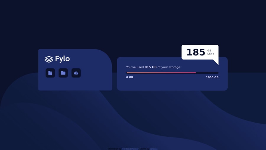
Design comparison
Solution retrospective
I used relative positioning for the white bubble with "185GB left". It is the good way to position this element because the transition between desktop and mobile is bad ?
Community feedback
- @artimysPosted about 4 years ago
Hi there Pimoux, your desktop design looks good.
For your 185GB container I would recommend making it
position: absoluteand usingtopandrightproperties to position it. The super important part is to make the parent container of your 185GB divposition: relative.Other suggestions:
-
When the browser shrinks there is a horizontal scrollbar that appears. That would probably go away I imagine if you decide to add the mobile version.
-
Your solution report has some basic stuff that needs attention. (solution report)[https://www.frontendmentor.io/solutions/htmlcss-RqwA_I8lU/report]
Hope it helps. Keep on coding!!
1@pimouxPosted about 4 years ago@artimys I corrected all the mistakes (report and positioning) and it works, moreover the horizontal scrollbar disappeared. Thank you for helping me even if I really need to understand the positioning behaviour.
0 -
Please log in to post a comment
Log in with GitHubJoin our Discord community
Join thousands of Frontend Mentor community members taking the challenges, sharing resources, helping each other, and chatting about all things front-end!
Join our Discord
