

Design comparison

Solution retrospective
I am most proud of creating a clean and aesthetically pleasing recipe page that is not only visually appealing but also functions well across different devices, thanks to the use of Mobile-First and Responsive Design principles. I am particularly happy with how I structured the HTML and CSS to create a harmonious balance between the content and styles.
What would I do differently next time: 1. Use of preprocessors (e.g., Sass/SCSS) to better organize styles and create variables for colors, fonts, sizes, etc. This would make scaling the project in the future much easier. 2. Image optimization: I would have performed additional image optimization to reduce loading time, especially for large images. 3. Animations and transitions: I would add smooth animations or effects to enhance user interaction, such as hover effects or content loading transitions. 4. Cross-browser testing: To ensure the best appearance across all browsers and devices, I would have tested the site more thoroughly in different browsers and made any necessary adjustments for compatibility. 5. Add interactive elements: For example, an interactive timer or the ability to select ingredients that automatically adjust the number of servings.
These improvements would help make the project more dynamic and user-friendly, while also providing greater flexibility in its use.
What challenges did you encounter, and how did you overcome them?During the project, I faced a few challenges, and here’s how I addressed each of them:
-
Responsive Design and Mobile-First Approach • Problem: Ensuring that the design was mobile-friendly and looked good on all screen sizes was a bit challenging, especially when trying to balance image sizes and text formatting for smaller screens. • Solution: I adopted a mobile-first approach, starting by designing for small screens and progressively adding styles for larger screens using media queries. This allowed me to optimize the layout for smaller devices first, and then adjust for larger screens.
-
Aligning Content Properly in the Layout • Problem: Ensuring that different sections of the content, like the recipe image, ingredients, and instructions, aligned properly and looked visually balanced took some time. • Solution: I used techniques like flexbox and grid layouts to align content dynamically. This gave me more control over how elements were distributed across the screen, especially when the viewport size changed.
-
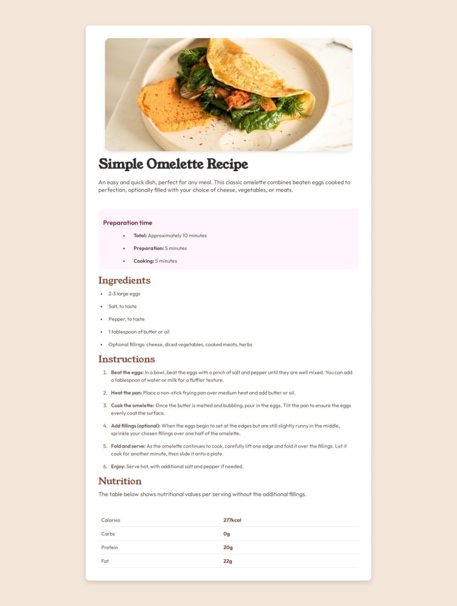
Image Optimization • Problem: The recipe image was quite large, which could affect the loading time and performance of the page, especially on mobile networks. • Solution: I compressed the image before using it on the page to make sure it was optimized for faster loading. I also used the max-width and height properties in CSS to ensure that the image was responsive and didn’t overflow or distort on smaller devices.
-
Styling Complex Elements (e.g., Tables and Lists) • Problem: Styling the nutrition table and lists in a way that kept the content readable, visually appealing, and consistent with the overall theme was tricky. • Solution: I utilized CSS properties like border-collapse for the table and customized the table cells with padding and borders. For the lists, I adjusted the spacing and added custom markers for better readability. I also paid close attention to the font sizes and colors to ensure accessibility.
-
Ensuring Cross-Browser Compatibility • Problem: Initially, some CSS styles were not rendering consistently across different browsers (especially with certain flexbox properties). • Solution: I tested the page in multiple browsers (Chrome, Firefox, Safari) and made use of vendor prefixes and fallback styles where necessary. I also checked the project in developer tools to ensure that elements behaved as expected across browsers.
-
Font Loading • Problem: Ensuring that custom fonts loaded correctly, and the text didn’t appear with a fallback font before the custom font loaded, was a bit of a concern. • Solution: I used font-display: swap in the font-face CSS to avoid the flash of unstyled text (FOUT) and ensure the text would use the fallback font until the custom font had fully loaded.
By breaking down these issues and addressing them one by one, I was able to create a functional, aesthetically pleasing recipe page that works well on different devices and browsers
Community feedback
Please log in to post a comment
Log in with GitHub
Join our Discord community
Join thousands of Frontend Mentor community members taking the challenges, sharing resources, helping each other, and chatting about all things front-end!
Join our Discord