Solution retrospective
What are you most proud of, and what would you do differently next time?
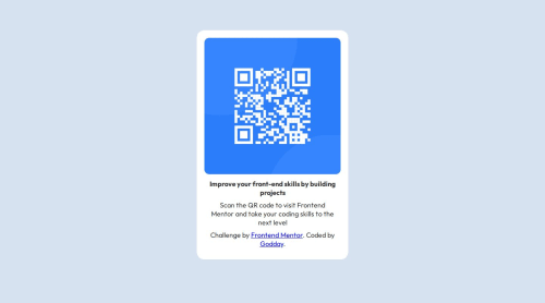
Proud of how i was able to align my main area to the center and what i would do differently is use flexbox
What challenges did you encounter, and how did you overcome them?i encountered trying to place my image in the right place and aligning
What specific areas of your project would you like help with?i am having issues with css
Code
Loading...
Please log in to post a comment
Log in with GitHubCommunity feedback
No feedback yet. Be the first to give feedback on OJIJEVWE PETER GODDAY's solution.
Join our Discord community
Join thousands of Frontend Mentor community members taking the challenges, sharing resources, helping each other, and chatting about all things front-end!
Join our Discord