Design comparison
Solution retrospective
i will make better websites next time. Please give me some reviews and where are the problems tell me.
Community feedback
- @beowulf1958Posted 2 months ago
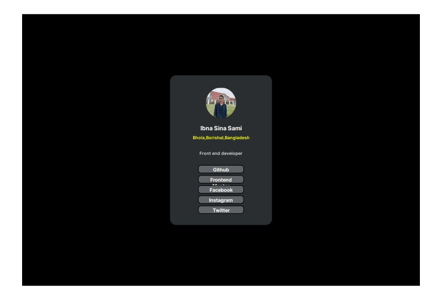
Congratulations on completing this challenge. It looks great so far. The only problem is with the buttons. The problems are easily fixed.
First, the buttons are too short; they look cramped and the "Frontend Mentor" text bleeds out. All you need to do is make
ul li { width: 200px; }and that will fix the text overflow.Second, the buttons need a hover state. The style guide lists a bright green color for this purpose. Add the following:
  ul li:hover {
    background-color: hsl(75, 94%, 57%);
    color: black;
  }
Now your site looks awesome.
Marked as helpful1@sinasami000Posted 2 months ago@beowulf1958 Thank you very much for your advice. I will try not to make the same mistake again.
0
Please log in to post a comment
Log in with GitHubJoin our Discord community
Join thousands of Frontend Mentor community members taking the challenges, sharing resources, helping each other, and chatting about all things front-end!
Join our Discord
