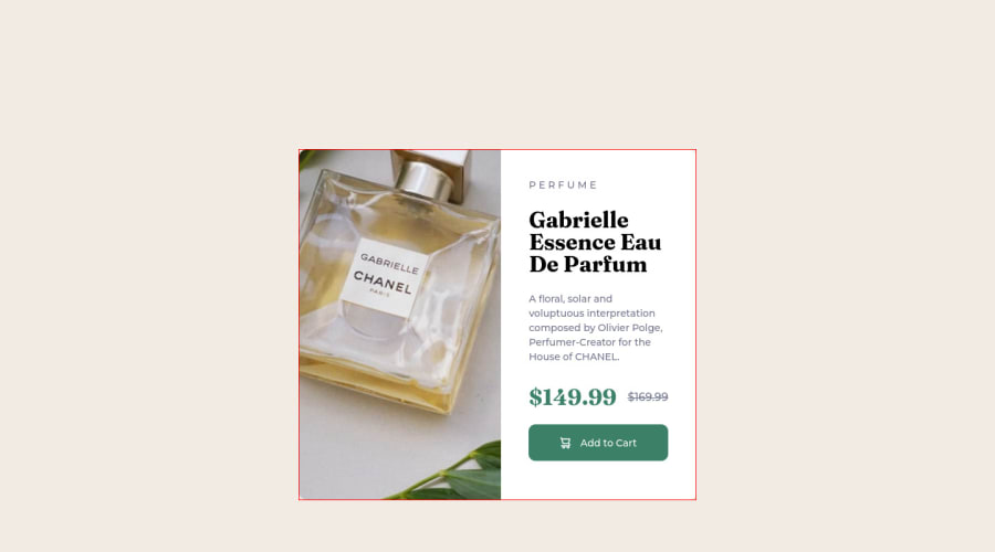
Design comparison
Solution retrospective
Hello all. I really struggled with centering this one and the responsive layout gave me some trouble as well. Not my best work, but its decent.
Community feedback
- Account deleted
Hey there! 👋 Here are some suggestions to help improve your code:
- Your content is not fully responsive. Here is a link to Google Developer’s site that will teach you how make it 100% responsive:
- The
alt tagdescription for the image needs to be improved upon. You want to describe what the image is; they need to be readable. Assume you’re describing the image to someone.
More Info:📚
https://www.w3.org/WAI/tutorials/images/
- There needs to be a
sourceinside yourpictureelement.
Here is an example of how it works: EXAMPLE
Syntax:
  <picture>
    <source media="(min-width: )" srcset="">
    <img src="" alt="">
  </picture>
More Info:📚
https://www.w3schools.com/html/html_images_picture.asp
- The name of the perfume , “Gabrielle Essence Eau De Parfum”, is the most important content in your card so it should be wrapped in a heading Element.
- Currently, the old price (169.99) 🏷 is not being properly announced to screen readers. To fix this, you are going to wrap the the price in a
delelement and inside it you will add aspanelement with ansr-only classthat will state something like “The previous price was…” and use CSS to make it only visible to screen readers.
More Info:📚
If you have any questions or need further clarification, feel free to reach out to me.
Happy Coding! 🎄🎁
0
Please log in to post a comment
Log in with GitHubJoin our Discord community
Join thousands of Frontend Mentor community members taking the challenges, sharing resources, helping each other, and chatting about all things front-end!
Join our Discord
