Design comparison
Solution retrospective
By trying this "simple" challenge I realize how much more I need to learn. I think there is a lot of mistakes in my code that could have been completed far more easily than I have done.
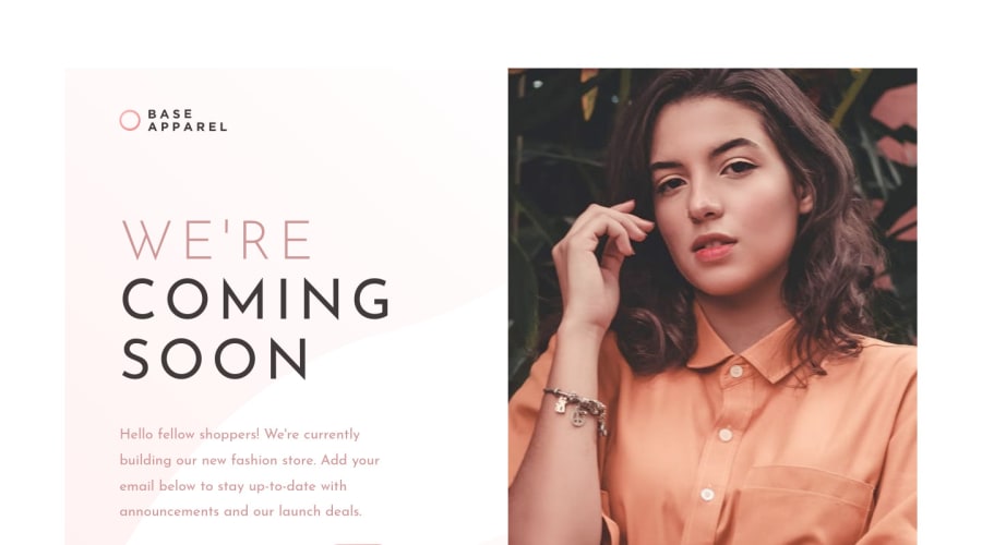
For example when I was trying to do fullsize windows - from edge to edge, the aspect ratio for the image on the right wasnt right. only the top half could be seen. When I changed the dimensions a bit, the card wasnt centered. In the end I put max-width 75% that sort of solved it, but i am not happy with it.
I will be happy for any feedback.
Community feedback
Please log in to post a comment
Log in with GitHubJoin our Discord community
Join thousands of Frontend Mentor community members taking the challenges, sharing resources, helping each other, and chatting about all things front-end!
Join our Discord
