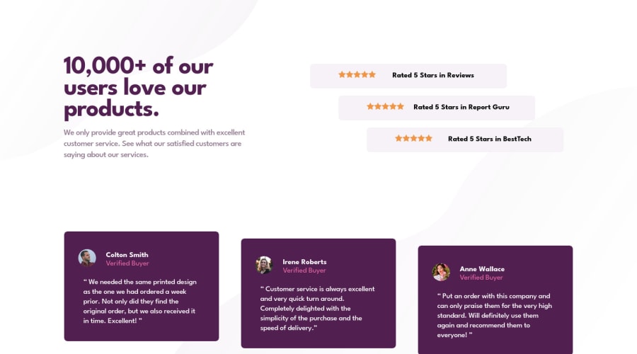
Submitted about 2 years ago
HTML&CSS, Git&Gitflow, Flebox, and Positioning
@Have-Samuel
Design comparison
SolutionDesign
Solution retrospective
Hello Guy,
Hope you are well. Ideas, suggestions, and comments are welcome
Community feedback
- @davidFreelance19Posted about 2 years ago
Hello developer! Congratulations on completing this challenge. I have seen your code and bring you some tips and improvements on your code! (Only for desktop layout)
body {
     display: flex;
     align-items: center;
     height: 100vh;
}
.container{
     width: 100%;
}
.starts{
     padding: 0;
     display: flex;
     flex-direction: column;
     width: 100%;
}
.starts-units{
     display: flex;
     align-items: center;
     justify-content: space-around;
     align-items: center;
     margin-left:0
}
.extension-1{
     align-self: center;
}
.extension-2{
    align-self: end;
}
I recommend you study the display flex themes a little more, we can't always use margin or padding to be able to replicate a design. Also this will help you to have a cleaner and easier to maintain code. I hope my suggestions help you, take care!
David Rodriguez
Marked as helpful0 - @Have-SamuelPosted about 2 years ago
Thank you, David, That was helpful I will be looking forward to more ideas like that.
Cheers Have
0
Please log in to post a comment
Log in with GitHubJoin our Discord community
Join thousands of Frontend Mentor community members taking the challenges, sharing resources, helping each other, and chatting about all things front-end!
Join our Discord
