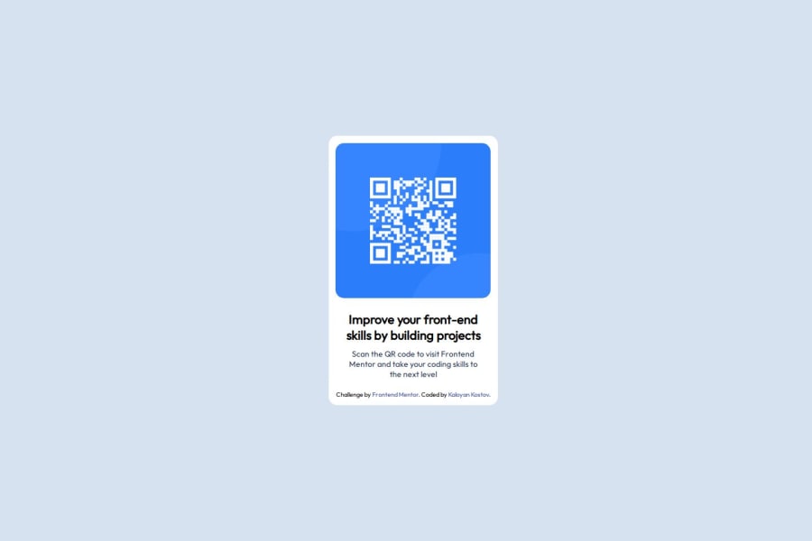
Design comparison
Solution retrospective
I would most likely create a separate CSS file where I can put my styling, so that the HTML is cleaner.
What challenges did you encounter, and how did you overcome them?I had some issues with making the component appear in a proper way for mobile devices.
Community feedback
- P@Git-DEmiGoDPosted 8 months ago
your code meets the design pretty well, but as I could see from the code you provided, it wasn't very semantic, also providing proper "aria" labels helps with the accesibility of the code.
certainly your idea to have a separate CSS file is good and even I would like to code that way,
you design was nice within all the screen ranges.
great work!
0
Please log in to post a comment
Log in with GitHubJoin our Discord community
Join thousands of Frontend Mentor community members taking the challenges, sharing resources, helping each other, and chatting about all things front-end!
Join our Discord
