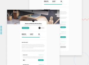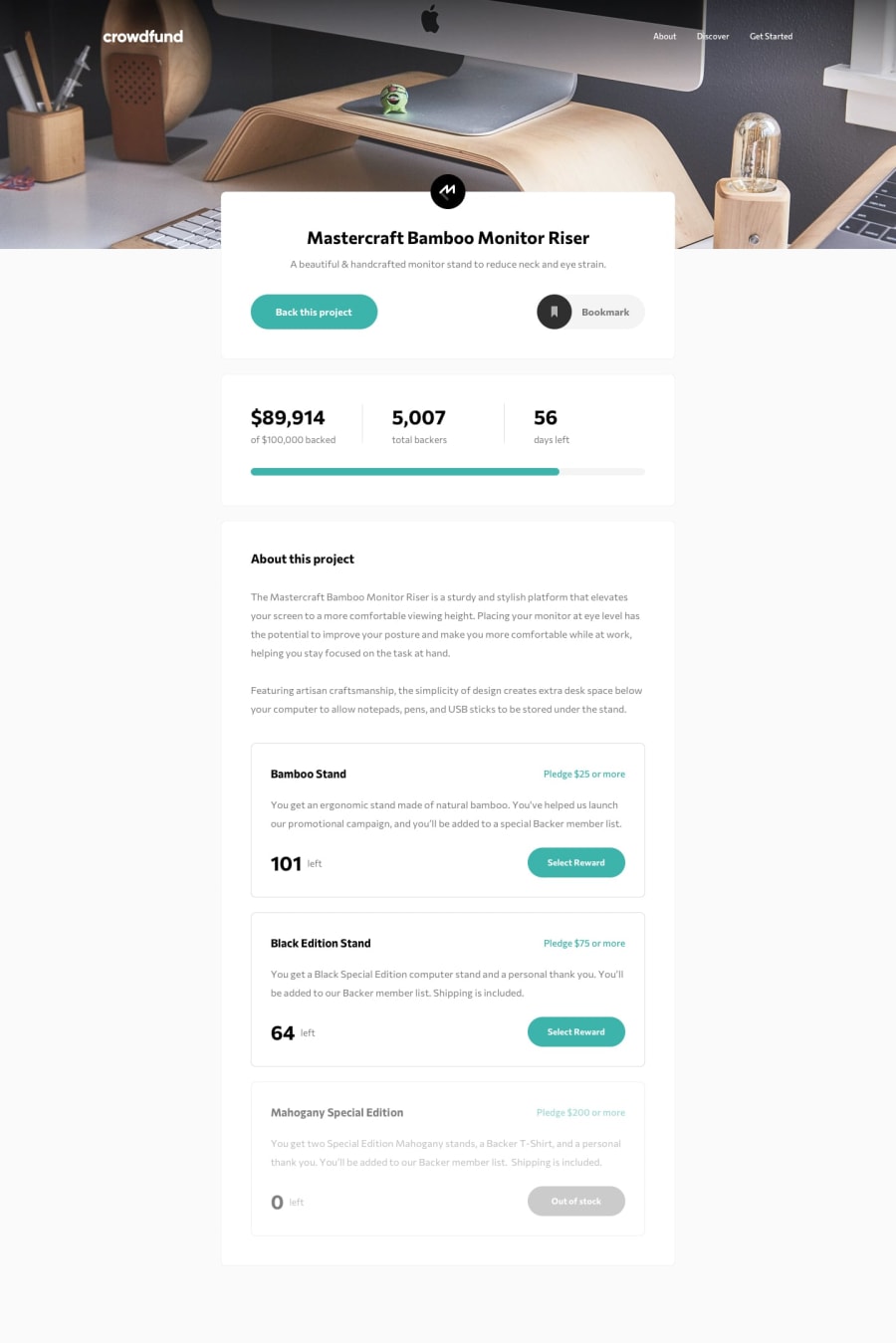
Design comparison
Solution retrospective
I think there are quite some things that can be done here. I am not able to figure out how to close input of one when other is clicked so if anyone can help I'll be grateful. Also this took me way more time than I expected and I even lost track of it sometimes so I would really appreciate feedback on my code. Thanks!
Community feedback
- Account deleted
It works, but there are some things that I noticed.
The mobile menu is not centered, I'm not sure if that is how it is supposed to be as I have not done this challenge.
Clicking the hamburger, opening the mobile menu, and then switching back to desktop does not fully dismiss it, as the shadow/overlay and the close icon still remain there.
1@aasthaanand123Posted over 3 years ago@thulanigamtee Thanks for the feedback! I did not notice the mobile menu and overlay in desktop mode. Thanks for pointing it out, I'll surely correct it.
0
Please log in to post a comment
Log in with GitHubJoin our Discord community
Join thousands of Frontend Mentor community members taking the challenges, sharing resources, helping each other, and chatting about all things front-end!
Join our Discord
