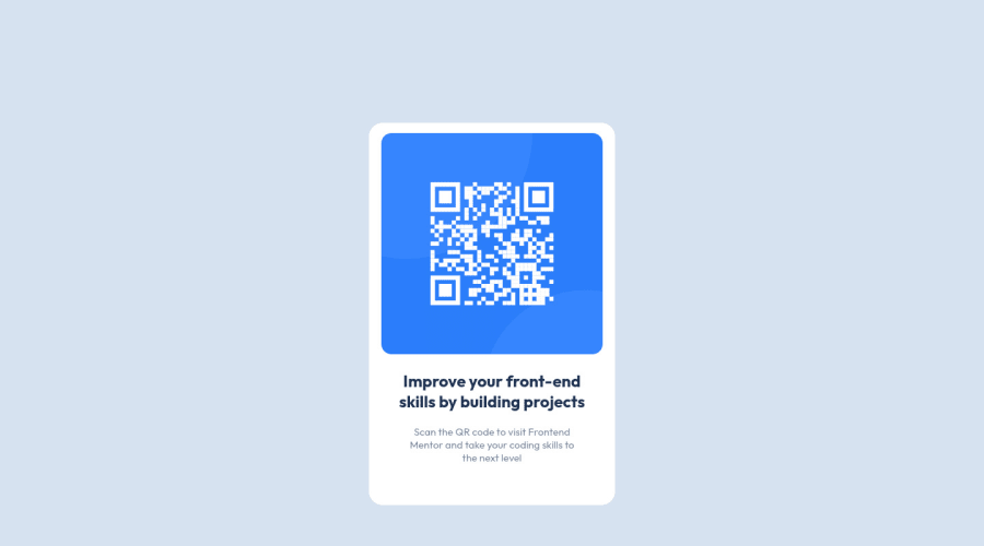
Design comparison
Community feedback
- @ArthurPogPosted over 2 years ago
Good job Mohammed! The card component itself looks good but when I was viewing it on my mobile it wasn't centred on my screen. I had to swipw left to bring it into view.
There are many ways to fix that. One of the solutions is "centering an element using flexbox", you can try Googling it or check my code for the same peoject. If you have any difficulty, let me know by replying to this message and I'll help you.
Keep crushing it!
Marked as helpful0@moakintundePosted over 2 years ago@ArthurPog Thank you Arthur for your feedback, I've made modifications. Can you review and likewise share a feedback.
1 - @ArthurPogPosted over 2 years ago
Hey, my man! Good fix. I now see it on any screen. It's horizontally centered but not vertically. Do you have any idea how to center an element vertically?
0@moakintundePosted over 2 years agoNot yet, to the best of my knowledge at this time.
0@ArthurPogPosted over 2 years ago@moakintunde Alright so I checked your, here's what you can do, but mind you it is only ONE of many different ways you can do this:
Go to the
bodyselector and try the following:Delete the
padding-top:80px;, because if you don't you'll always have a scrollbar even when there is nowhere to scroll. You can do this more elegantly with you main container. We'll get to it in a moment.Give the body a
min-height: 100vh;which says: Use 100% of the screen height to calculate the vertical position of the content of this container (everything inside ofbody).Tell the body to display its content using flexbox -
display: flex;.Your browser orders block elements (such as
<div>,<p>,<section>, etc.) vertically from top to bottom by default. By making the body display its content (like yourcontainerclassdivand yourattributionclassdiv) using flexbox it will start ordering your block elements horizontally from left to right. That is not good, so we'll add another property -flex-direction: column;which will force the content to be vertical again.We then need to align the elements horizontally in the center. We usually do this with
justify-contentbut not this time. Remember, we flipped the flexbox by 90 degrees so horizontal is now vertical :D So we need to addalign-item:center;which normally centers things vertically to do it horizontally here.Then we need to do the same thing but vertically and we'll do that with... you guessed it -
justify-content:center;:)This will center your content horizontally and vertically.
Now we need to do it so when you make the browser really short, the main container doesn't stick flush to the top of the window or the sides when it gets too narrow, which is ugly. So we need a margin.
Go to your
.containerselector and delete the auto frommargin: 0 auto;and change the 0 to whatever you like, can be 25px, for example or, even better, tell it the distance in % orrem.remis based off of your root font value. So if you set the:root {font-size:15px;}as per your style-guide.md then 2rem equals 2x root font size which is 15, so 30px. This is very neat because the size will change based on your font size. So addmargin: 2rem;to your.containerselector.This should do it :)
Marked as helpful0@moakintundePosted over 2 years ago@ArthurPog thank you once again; I'd make refix.
0@moakintundePosted over 2 years ago@ArthurPog thank you for this feedback it worked the wonders and as well did give me a clear view as to how the flex works I had previously understood it features horizontally. I'm really enjoying the space I'd go ahead now to try other challenges.
1@ArthurPogPosted over 2 years ago@moakintunde Two thumbs way up! Great job. I love the challenges and the community here too. Keep it up, brother!
Marked as helpful0
Please log in to post a comment
Log in with GitHubJoin our Discord community
Join thousands of Frontend Mentor community members taking the challenges, sharing resources, helping each other, and chatting about all things front-end!
Join our Discord
