HTML5, CSS3, Vanilla Js, React, TypeScript
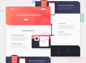
Design comparison
Solution retrospective
This is my first challenge here on the site, my only regret was not to have known Frontend Mentor before.
Community feedback
- @pikapikamartPosted over 3 years ago
Hey, great work on this one. The desktop layout I guess is fine, though the content are spaced out more. Though the mobile state is good and you made different approach on the pop up menu bar.
Suggestions would be:
-
Please refrain from using
vhas units especially on a container or an important component. Usingvhwill only limit your element based on the remaining viewport's height. So meaning, when a device have a smaller dimension, in terms of height, then the layout for them will change because your content is based on the viewport. Use another units likerem, those unit that will not scale with the viewport height. Try opening dev tools from the bottom, you will that your container, and the second phone image is scaling as well. -
Your navbar link's font is not rendering the proper font. It is on the default, you might want to check that. Also, it will be better if a user clicks on another navbar link, while there is one dropdown that is show, making the former hides. Right now, I can select all of them and all of it shows, making the unclicked menu bars hidden will be really great.
-
White space. As you can see, there are large portions of white space on your 3 sections. It will better if you make the content more near to one another and not spaced out.
-
Multiple usage of h1. Though for some users, it is fine to use multiple h1 since there are no issue upon doing so right, but, for some users who uses screen reader, it might cause some issue. It is better to follow the right hierarchical usage of header tags. Starting from the h1 going down to h6, and not just all h1.
-
The mobile state for the dropdown, when I click on all of the three, they are now overflowing and the container does not respond to it very well, because there are declared
heighton it. It will be better if you remove those or much preferably, like what I stated above, make the former clicked dropdown be hidden, if a user clicks another.
Also, clearing up those accessibility and html issues will be really awesome.
But still, good job on this one^
0@ArturdaSilvaRezendePosted over 3 years ago@pikamart Thank you so much for the feedback, I will make the corrections you said, in future projects I will use with caution the units of measurement.
0 -
Please log in to post a comment
Log in with GitHubJoin our Discord community
Join thousands of Frontend Mentor community members taking the challenges, sharing resources, helping each other, and chatting about all things front-end!
Join our Discord
