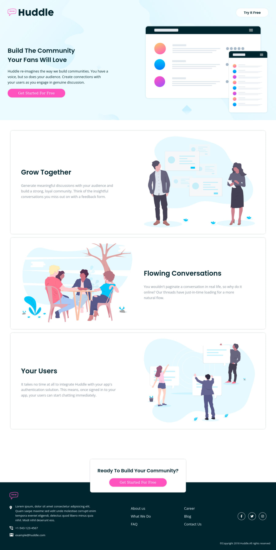
Design comparison
SolutionDesign
Solution retrospective
any reccommendations or enhancments? ^_^
Community feedback
- @john-mathisPosted about 3 years ago
Everything looks spot on besides the footer logo, the telephone number color, and hover effects of the links in the footer. (on mobile) To get the image in the footer white i used filter: brightness(0) invert(1); on the image!
Marked as helpful1
Please log in to post a comment
Log in with GitHubJoin our Discord community
Join thousands of Frontend Mentor community members taking the challenges, sharing resources, helping each other, and chatting about all things front-end!
Join our Discord
