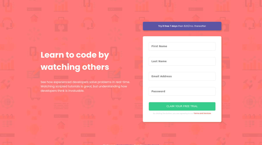
HTML5, CSS3(flexbox and media queries) and JavaScript
Design comparison
Solution retrospective
I would really appreciate if you guys can give feedback about to how my code is. Thanks!
Community feedback
- @RahulbaranPosted over 3 years ago
Hey Aastha , Hi I am Rahul. There are a number of issues towards which I would like to highlight and sorry about such a big list of issues . I have found following issues and added some links for help:-
-
Instead of using button tag inside your form tag use input type="submit" , which will make your code more accessible. Also there are issues with other input fields and labels. you should use field specific input types instead of using type="text" for each field. For example:- password field ----> type ="password" submit field ----> type="submit" email field ----> type="email" This is a great article by CSS-Tricks (it is an amazing site for web development related things) which has everything I mentioned above along with some extra amazing stuffs :- (https://css-tricks.com/html-inputs-and-labels-a-love-story/) Now let's come to the second issue
-
While adding attribute target="_blank" in anchor tag, you should also mention rel = "noreferrer noopener" . Read about it here:- Link-1 : -- (https://stackoverflow.com/questions/50709625/link-with-target-blank- and- rel- noopener-noreferrer-still-vulnerable) Link-1 :-- (https://web.dev/external-anchors-use-rel-noopener/)
-
While using id attribute when you have to mention one id with more than character then you can use either dash(-) or underscore(_) . adding space will create more than one id. Eg:- <h1 id="First Name"></h1> // two id's "First" and "Name" // instead use this <h1 id="First_Name"></h1> // one id First__Name(First-Name can also be used)
Here are some suggestions which I would like to deliver:-
- Add more comments in your code
- read about custom properties these are quite useful and make your code DRY (Don't Repeat Yourself ). Link for custom properties:- (https://css-tricks.com/a-complete-guide-to-custom-properties/)
- also read about universal selector and box-sizing property in css.
That's all from my side. I hope, next time you write more accessible code Read here about accessibility:- (https://www.w3.org/WAI/standards-guidelines/wcag/).
Take Care and be consistent.
0@aasthaanand123Posted over 3 years ago@Rahulbaran Thanks for the feedback! I don't have much idea about accessibility so I usually get stuck up in that. I'll definitely try to improve and will reference the resources you mentioned. Thanks!
0@RahulbaranPosted over 3 years ago@aasthaanand123 , Here is an article about accessibility where a number of accessibility tools have been mentioned :- https://uxdesign.cc/designing-for-accessibility-is-not-that-hard-c04cc4779d94
0 -
- @palgrammingPosted over 3 years ago
right after your page transitions from mobile to desktop at about 700px you might might want to see how small your form is getting at the transition point. you might think about making the page transition later
also your error images might need a little more white space in their positioning on their right side
also when the input is active or focused the placeholder text should become more bold or darken
but you have a good start to this project just a little more fine tuning
0@aasthaanand123Posted over 3 years ago@palgramming Thank you for the feedback! I could not figure out how to manipulate the placeholder text and I'll change the transition point. Thanks!
0
Please log in to post a comment
Log in with GitHubJoin our Discord community
Join thousands of Frontend Mentor community members taking the challenges, sharing resources, helping each other, and chatting about all things front-end!
Join our Discord