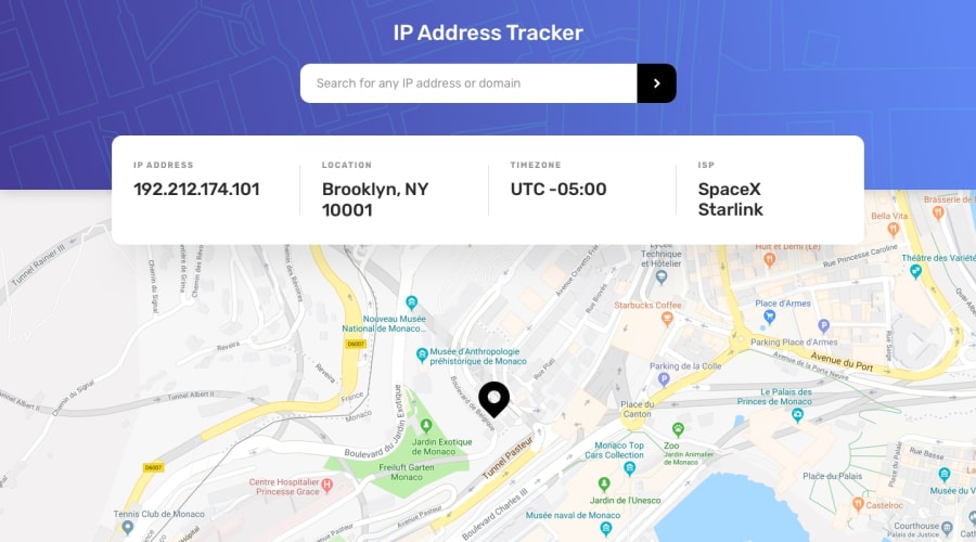
Design comparison
Solution retrospective
thanks I have submitted the solution can you give me a feedback <3
Community feedback
- @rohailtahaPosted almost 4 years ago
Nice one Yahya, but I think you forgot to add the marker image
0@coding404lifePosted over 3 years ago@Rohail77 Hello thanks so much and sorry for the late reply thanks so much for the feedback mate I appreciate it kind wishes:)
0 - @v-larcherPosted almost 4 years ago
Hi @coding404life ! Nice work !
I notice a small difference in term of typography in the ip-info section, maybe modify some properties like font size, weight and letter spacing? And also, you misspell "location". Besides those two small details, I liked it, specially the responsiveness.
Have a nice day mate ! :)
0@coding404lifePosted over 3 years ago@v-larcher Hello thanks so much and sorry for the late reply thanks so much for the feedback mate I appreciate it kind wishes:)
0
Please log in to post a comment
Log in with GitHubJoin our Discord community
Join thousands of Frontend Mentor community members taking the challenges, sharing resources, helping each other, and chatting about all things front-end!
Join our Discord
