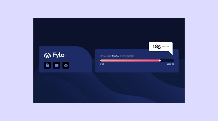
Design comparison
Solution retrospective
Hello everyone, I would be grateful if you could look at how I did this and comment and give some advice. thank you :)
Community feedback
- @samuelpalaciosdevPosted over 3 years ago
Hi, Aleksandar👋
Great job on this challenge. Your solution looks pretty good👍
I only suggest some things 😉:
-
Changing some styles of the main container .flyo-wrap, setting a width: 100vw to make it covers the whole viewport-width and setting a height: 100vh to make it covers the whole viewport-height.
-
Making the buttons into real buttons by using <a>(anchor links) or <button>(button elements).
I hope you have a nice day, keep coding!💙
0@Aleksandar-93Posted over 3 years ago@samuelpalaciosdev I made changes thanks for the suggestion :)
0@samuelpalaciosdevPosted over 3 years ago@Aleksandar-93 I'm glad I helped you, if you could upvote my reply would helped me. Thank u, have a nice day!
0 -
- @AgataLiberskaPosted over 3 years ago
Hi @Aleksandar-93! Well done on this, it looks great :) But I think it would be a good idea to make the buttons into actual buttons, and add some hover states.
Hope this helps :)
0@Aleksandar-93Posted over 3 years agoYou're right, now i changed that thanks for the suggestion :)
0 - @haryor745Posted over 3 years ago
Its perfect!
0
Please log in to post a comment
Log in with GitHubJoin our Discord community
Join thousands of Frontend Mentor community members taking the challenges, sharing resources, helping each other, and chatting about all things front-end!
Join our Discord
