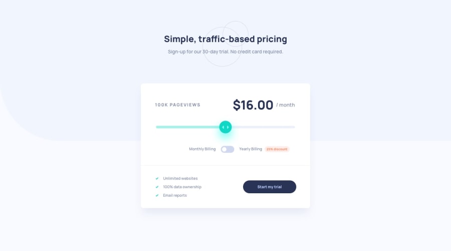
Design comparison
Solution retrospective
Any feedback is welcome
Community feedback
- @FarisPalayiPosted over 3 years ago
Looks good and responds well 👍
Although, there are some things to improve when it comes to accessibility.
- Toggles should be a focusable and interactive element, currently, you are using a div to create the toggle, which is not focusable intrinsically, so I suggest you to use a checkbox or radio button as the toggle.
- If you try to navigate through the site, there is no visual feedback on where your focus is. Try to add
:focusstate styles. - And also you can add
cursor: pointerto better indicate interactivity on your 'start my trial' button.
Here are 2 articles that I think you might find helpful :
HTML: A good basis for accessibility, Semantic HTML5 Elements Explained
Besides these, site is working well and have fun coding and learning ✨
Marked as helpful0 - @palgrammingPosted over 3 years ago
you should combine your two buttons into one they are currently fighting each other when the user interacts with them
Marked as helpful0@DmytroTarasiukPosted over 3 years ago@palgramming I've just decided two add to buttons instead of 2 as was in challenge. In my mind it's more readable. It is fighting because you can choose only one option and then according to the selected option the input range will take the right labels
0
Please log in to post a comment
Log in with GitHubJoin our Discord community
Join thousands of Frontend Mentor community members taking the challenges, sharing resources, helping each other, and chatting about all things front-end!
Join our Discord
