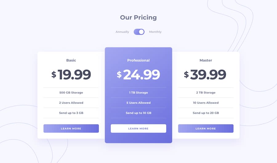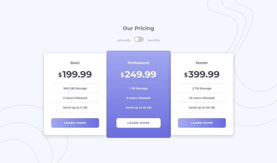
Design comparison
Solution retrospective
Hi there, I really liked the design and here's my question:
- Accessibility for switch component (role, aria-label, aria-checked)? What attributes should be used and what elements to put them on?
Any feedback is appreciated π±βπ
Community feedback
- @dwhensonPosted over 3 years ago
Hi @TrashAlphonse - nice work on this one! π
Aria is tricky stuff, and I'm certainly no expert here, but by using the
checkbox
element you actually have most of the requirements for screen readers built in, so you don't need to worry too much in this case - the best thing to do is actually just try it with a screen reader and see how it sounds, and if it makes sense.The main thing to start with is an idea of what the switch is intended to do, In this case, I used a radio input rather than a checkbox as it seemed to me that there was two distinct states - yearly or monthly. This article has a very nice and detailed write up on how to approach the issue: https://www.sarasoueidan.com/blog/toggle-switch-design/
If you check the codepen Sara doesn't actually add any additional aria attributes as she has selected the optimal HTML element so it's not needed! This is in general always the best option.
If you are interested in exploring this further there is a really good free course on accessibility on the Udactiy site. Have a quick Google and check it out - it really helped me.
Cheers π
2@dwhensonPosted over 3 years agoSorry one last thing to mention with regards accessibility is to make sure that you have your focus states set up - at the minute if I tab through your page I can only see focus when I'm on the
button
elements - not the switch - but the toggle does work very nicely with the keyboard so great work there! π1@TrashAlphonsePosted over 3 years ago@dwhenson Hey, thanks for the hint, to be honest I haven't even thought about using radio inputs although there's much logic in this.. And yeah, ARIA can be so challenging π€ Not to mention switch components styling ... π
0@dwhensonPosted over 3 years ago@TrashAlphonse I think I did this one twice! First with a checkbox and then with radio buttons!
0 - @RocTanweerPosted over 3 years ago
I didn't get your questions completely π but here's what I understand π
aria-label attribute is used on elements having no label or name.
This is because label is used to identify the element to external technology through accessibility API
Hope it helps π (happy coding..!)
0
Please log in to post a comment
Log in with GitHubJoin our Discord community
Join thousands of Frontend Mentor community members taking the challenges, sharing resources, helping each other, and chatting about all things front-end!
Join our Discord