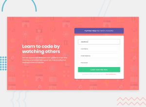
Design comparison
Solution retrospective
Feedbacks are welcomed! : )
Community feedback
- @NAZIRwill29Posted over 2 years ago
@RTX3070 awesome website.
The desktop view are not functioning, should change
@media screen and (min-width: 1440px)to@media screen and (min-width: 600px). The 1440px will never be trigger because the it is max view for desktop. Make it 600px because it is the size for mobile view.@media (min-width: 1440px)mean the style will apply for size view > 1440px.Marked as helpful1@RTX3070Posted over 2 years ago@NAZIRwill29 Thanks for the info, your monitor is less than 1440px wide?
0@NAZIRwill29Posted over 2 years ago@RTX3070 yeah, my monitor is kind of less than 1440px. But that is not the problem, the problem is as you design your web for mobile-first, then you want to make style for desktop, you should state the
@mediato be applied to the max mobile width so that for width above the mobile width will be applied the desktop style.1@RTX3070Posted over 2 years ago@NAZIRwill29 but my media queries are "min-width: 375px" and "min-width: 1440px", so from 375px to 1439px is for mobile and from 1440px and above is for desktop.
0@NAZIRwill29Posted over 2 years ago@RTX3070 owh! so that's what you want to do😅. Normally, for the view above 600px is consider to be desktop view not mobile view. That why every programmer do
@media (min-width: 600px)for desktop style.Marked as helpful1 - @Babajide777Posted over 2 years ago
Your solution seems to be for only mobile display. The media query for desktop display isn't working.
1@RTX3070Posted over 2 years ago@Babajide777 That's strange, works both on mobile and desktop on my end...
0
Please log in to post a comment
Log in with GitHubJoin our Discord community
Join thousands of Frontend Mentor community members taking the challenges, sharing resources, helping each other, and chatting about all things front-end!
Join our Discord
