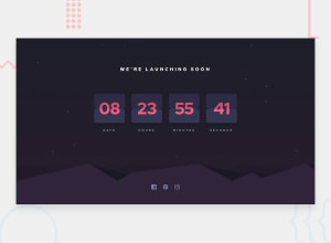
Design comparison
SolutionDesign
Solution retrospective
Hey, I did not work on the design to be 100% matching, but can someone tell me if there are any thing related to the efficiency or UI/UX to be improved? Thanks! P.S: I also made it possible for the user to choose the initial remaining time.
Community feedback
- Account deleted
Hi,
Nice implementation on letting the user decide the time, it's quiet unique, and I think the design look good.
You should fix the responsiveness because at some point when you decrease the screen's width the seconds get completely cut off.
Keep coding👍.
Marked as helpful1@ritadoumetPosted about 3 years ago@thulanigamtee Hey, thanks for your feedback! I will definitely do this when I get the time.
0
Please log in to post a comment
Log in with GitHubJoin our Discord community
Join thousands of Frontend Mentor community members taking the challenges, sharing resources, helping each other, and chatting about all things front-end!
Join our Discord
