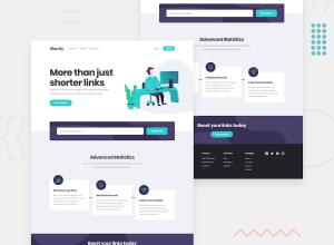
Submitted about 2 years ago
-HTML5 - CSS3 - Flexbox - Mobile-first workflow - Vanilla JS - API
@adetoye-dev
Design comparison
SolutionDesign
Solution retrospective
A review of my solution would be really appreciated.
Community feedback
- @hmadamkPosted about 2 years ago
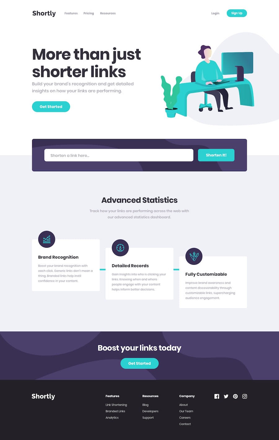
the site is amazing but you should give both the input and the submit button some padding so that the look better and more like the design
.form-item { padding: 1.8rem; }and the backgorund color of the second section is not the accurate one.advanced-statistics-container { background-color: rgb(240 241 246); } .shortened-links-container { background-color: rgb(240 241 246); }1@adetoye-devPosted about 2 years ago@hmadamk Thanks a lot for the review. I'll effect the changes immediately 👏👏
0
Please log in to post a comment
Log in with GitHubJoin our Discord community
Join thousands of Frontend Mentor community members taking the challenges, sharing resources, helping each other, and chatting about all things front-end!
Join our Discord
