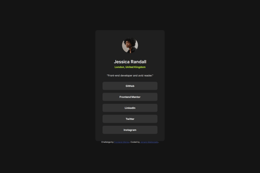
Design comparison
SolutionDesign
Solution retrospective
What are you most proud of, and what would you do differently next time?
Last time I used position:relative and position:absolute to centre objects in the viewport. This time, I used Flexbox.
I also used Figma to speed up the process.
At first, I was confused about what the main axis and cross axis meant when the flex-direction was set to row or column. Then, justify-content and align-items accomplish the same thing regardless of the flex-direction, but they look visually different.
I solved it reading some books on the topic.
What specific areas of your project would you like help with?I would like to know if I used relative units correctly.
Community feedback
Please log in to post a comment
Log in with GitHubJoin our Discord community
Join thousands of Frontend Mentor community members taking the challenges, sharing resources, helping each other, and chatting about all things front-end!
Join our Discord
