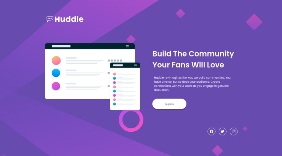
Design comparison
SolutionDesign
Solution retrospective
Feedbacks are welcomed! : )
Community feedback
- @isprutfromuaPosted over 2 years ago
Hi there. You did a good job 😎
keep improving your programming skills🛠️
your solution looks great, however, if you want to improve it, you can follow these recommendation:
- it's better to use link <a> tag here:
<span class="socials__facebook"><ion-icon name="logo-facebook" role="img" class="md hydrated" aria-label="logo facebook"></ion-icon></span>-
please add some transitions for buttons. You animation will be smoother =) I hope my feedback will be helpful.
-
There is no reason to use paddings for .col-2__description .
-
It'll be better to use link tag instead of the button. Register it's means that you will go to the register page.
Good luck and fun coding 🤝⌨️
Marked as helpful0
Please log in to post a comment
Log in with GitHubJoin our Discord community
Join thousands of Frontend Mentor community members taking the challenges, sharing resources, helping each other, and chatting about all things front-end!
Join our Discord
