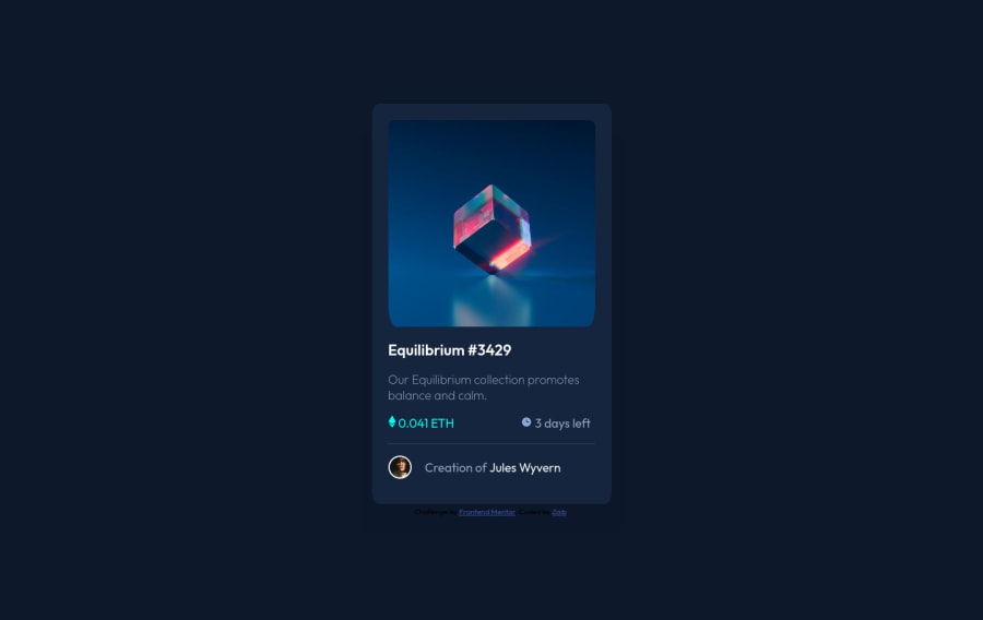
Design comparison
Solution retrospective
I could'nt fix the hover solution of Equilibrium image, so i left that part, can anyone help me put that missing part.
Community feedback
- @Eric-FerolePosted almost 3 years ago
Hi Zaib,
The most valuable quality of a developper is his capacity to solve problem by himself. At junior level, most of the solution can be find by googling the issues. Per example, for your hover problem you could make a search on Google with the keywords : "image hover css". The first results answer what you were looking for. This is the best way to improve.
Hope it helps,
Keep up !
Marked as helpful1@zaybaliPosted almost 3 years ago@Eric-Ferole Hi Eric, thank you for your feedback, i really appreciate that, i did google and applied multiple solutions in my code, but it didn't fit properly on image and also i was too mentally exhausted to solve that issue.
I left it there to solve later and have feedback by the community.
My mindset is that as I am a newbie, so I just have to keep doing challenges here and more I will practice more I will write CSS better, and when I will get enough expertise, I will solve the minor issues that I faced earlier in the journey, i.e., the image hover issue.
0 - @PhoenixDev22Posted almost 3 years ago
Hello @iamzakofficial,
I have some suggestions:
-
Anything with a hover style in the design means it's interactive . You need to add an interactive element around theimage ,
Equilibrium #3429
andJules Wyvern
(in this challenge is an anchor tag<a>
) -
The images
alt ="time" alt="eth"
don't need filledalt
. They are decorative images, soalt
attribute should be left intentionally blank. You can optionally addaria-hidden
orrole presentation
to ensure the images are always ignored by screen readers ANDimage-equilibrium.jpg"
and avatar's one shouldn't be empty read up about how and when to write alt text -
<span class="nft-title highlight">Equilibrium #3429<br></span>
no need for a span you can use a heading. -
The eye image doesn't really need to be in the html, you could do it with css.
-
The last part of the card you can use some semantic tags like:
<figure class=""> <img class="avatar-img" src="images/image-avatar.png" alt=""> <figcapton class=""> Creation of <a href="#">Jules Wyvern</a></figcaption> </figure>
-
You can simply use unordered list
<ul>
to wrapclass="info"
and in each list item would have<img > OR <Svg>
and<p>
. -
No need for this
<hr />
as you can useborder-top
to the<figure class="">
. -
You should use
em
andrem
units .Bothem
andrem
are flexible, scalable units which are translated by the browser into pixel values, depending on the font size settings in your design. Usingpx
won't allow the user to control the font size based on their needs. -
Try flexbox properties and a min-height 100vh on it to center the card.
body{ font-family: 'outfit', 'sans-serif'; font-size: 18px;/* Never use font-size in pixels*/ /* max-width: 1440px; */ background-color: hsl(217, 54%, 11%); display: flex; align-items: center; justify-content: center; flex-direction: column; min-height: 100vh; width: 100%; }
Hopefully this feedback helps.
Marked as helpful0 -
- @rsrclabPosted almost 3 years ago
Hi, @iamzakofficial ~
Congratulate on your solution to the challenge on FM platform. I have studied your work carefully and learned a lot from it.
Here are some of the tips I like to provide.
- I hope you to add transition effect for heading and images part of the card element.
- Adding
margin: auto
property to <main> element will center your card. - You can add
max-width: 100%
for image tags on this project. - On smaller devices, we need responsiveness. That's important part here.
https://www.frontendmentor.io/solutions/my-first-solution-on-chanllenge-V-4IzAivH
Here is my solution to this challenge, and if it can help you even a bit, it would be happy to me.
Cheers ~
Marked as helpful0@zaybaliPosted almost 3 years ago@tymren608 thank you so much, your suggestions and feedback were really helpful. I fixed most of the issues you said on my solution, just can't get hover color property working.
0@rsrclabPosted almost 3 years ago@iamzakofficial ~ You can check my code. Styles and HTML element structure is there. Cheers !
Marked as helpful1
Please log in to post a comment
Log in with GitHubJoin our Discord community
Join thousands of Frontend Mentor community members taking the challenges, sharing resources, helping each other, and chatting about all things front-end!
Join our Discord