Design comparison
Solution retrospective
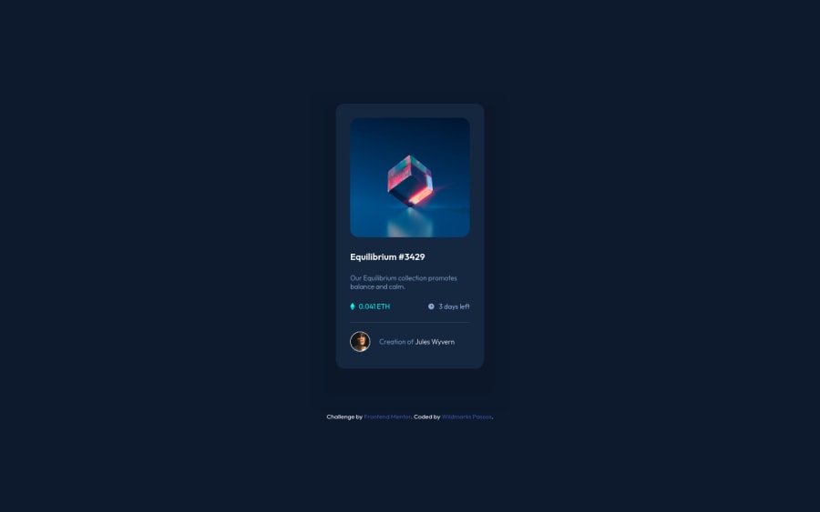
I noticed that in the original image of the challenge, in the color part -> #0c1729, there are some broken parts, does anyone know how I do this with CSS? I couldn't find anything relevant.
Community feedback
- @anoshaahmedPosted about 3 years ago
To avoid accessibility issues in the future, have at least one h1 in your code, start your headings with h1 and move up by one level each time
Good job! :)
Marked as helpful1@Wildmarks-PassosPosted about 3 years ago@anoshaahmed Nice. I will proceed to do this. Thanks!
1 - @Fernando0654Posted about 3 years ago
Where using
height: 100vh, I recommend to you usingmin-height: 100vh. That way, if content is too large, thebackground-colorproperty won't get overflowingHope this is helpful, man! ♧
Marked as helpful1@Wildmarks-PassosPosted about 3 years ago@Fernando0654 Show, I hadn't thought about it. Thanks for the tip!
0 - @al3xbackPosted about 3 years ago
Hi Wildmarks,
I see that the color (#0c1729) is not working cos it's overridden by children's background-color (#15273f) on class
contentContainer.The css concept is actually each children can overwrite/change the inherit value from the parent.
Marked as helpful0@Wildmarks-PassosPosted about 3 years ago@al3xback So, I couldn't quite understand the issue of color (#0c1729) not working, I've analyzed the project here and it seems to be working normally, in the secondContainer class, and in the contentContainer class the color (#15273f) is working as it should to happen. That's if I'm getting what you mean. Hahaha
0
Please log in to post a comment
Log in with GitHubJoin our Discord community
Join thousands of Frontend Mentor community members taking the challenges, sharing resources, helping each other, and chatting about all things front-end!
Join our Discord
