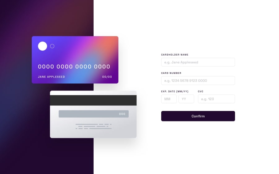
Design comparison
SolutionDesign
Solution retrospective
Hi everyone. This was a tough challenge but I had fun. There are parts of the challenge I couldn't complete yet; The first is the border when focusing on an input field. It says to use a gradient but I couldn't figure it out, and the second is getting the error messages to appear when the input is invalid and disappear when the user re-enters their data. I appreciate any help regarding these two points and any advice on the overall project. Thank you :)
Community feedback
Please log in to post a comment
Log in with GitHubJoin our Discord community
Join thousands of Frontend Mentor community members taking the challenges, sharing resources, helping each other, and chatting about all things front-end!
Join our Discord
