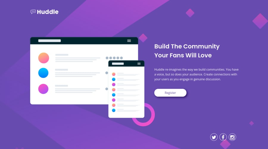
Design comparison
Solution retrospective
May have made more difficult than it should be using Grid for mobile and desktop layout. But got to learn many things about Grid. Hope I got it right.
Community feedback
- @NaveenGumastePosted about 3 years ago
Hello bikeinman ! Congo 👏 on completing this challenge
Let's look at some of your issues, shall we:
Just One think
- Warp your card content around the main tag Ex: 👇
<body>
<main class="container">
*all you content here*
</main>
</body>
happy Coding😀
0 - @GitHub-dev12345Posted about 3 years ago
You change the font-size of main heading, and paragraph. 😊
I hope you find this helpful
0@BikeInManPosted about 3 years ago@GitHub-dev12345 Thank you for taking a look. Did it look bad on your screen? Too big/ too small? For the first time, I used
clampon font-size. It looked alright on my screens. Please tell me more, I really don't know how to set responsive typography.0@GitHub-dev12345Posted about 3 years ago@BikeInMan Use font-size like:
font-size : 3vw; ( Give font-size value according your Design, you match your design with real design and check font-size is proper or not).
0 - @MojtabaMosaviPosted about 3 years ago
- Mixing bem and css selectors are not recomended becuase css selectors have higher specificity than bem selector, Spend some time reading about bem methodology.
Keep coding :=)
0@BikeInManPosted about 3 years ago@MojtabaMosavi Thanks for looking into the code. I have read some, but I did not pay attention to the specificity issue. I try to keep markup clean and try to avoid having classes for every element. For those, I can access with css selectors, I avoid. Good to know that I might run into problems with this habit. Long way for me to go, I guess. Thanks a lot.
0
Please log in to post a comment
Log in with GitHubJoin our Discord community
Join thousands of Frontend Mentor community members taking the challenges, sharing resources, helping each other, and chatting about all things front-end!
Join our Discord
