Design comparison
Solution retrospective
As i did not know how to use "flex" property yet, it was hard work to finish this simple challenge. Stil learning.
I am still not comfortable with "flexbox" property but i want to refine and perfect my knowledge.
Community feedback
- P@Islandstone89Posted over 1 year ago
Hi there, here are a few tips:
HTML:
-
You need a <main> - change the .container from a div to a main.
-
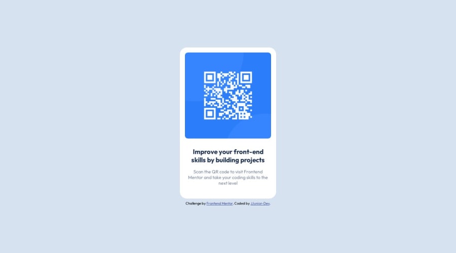
The alt text should also say where the QR code leads to, which in this instance is "frontendmentor.io".
CSS:
-
It's better for performance to link the fonts in the head of the HTML, not in the CSS.
-
Font-size should be in rem instead of px.
-
Max-width on the container should also be in rem, not px.
-
The container is centered vertically by using Flexbox and
align-items: centeron the body, and centered horizontally by usingmargin: 0 autoon the container itself. I would suggest letting Flexbox do both; remove the margin: 0 auto, and addjustify-content: centeron the body :) -
You can also put
text-align: centeron the body since all text should be center-aligned. -
You shouldn't have a separate stylesheet for the CSS Reset, or for the media queries. For a good CSS Reset, check out this one by Andy Bell
Hope this helps!
1@JJunior-DevPosted over 1 year ago@Islandstone89 I was without time to make the changes, but now it is done. Thank you again.
1 -
- P@mayor-creatorPosted over 1 year ago
@JJunior-Dev congrats on completing this challenge. Here's a great article on flex property https://webdesign.tutsplus.com/a-comprehensive-guide-to-flexbox-alignment--cms-30183t. it takes time to get comfortable with flex properties and keep practicing.
1
Please log in to post a comment
Log in with GitHubJoin our Discord community
Join thousands of Frontend Mentor community members taking the challenges, sharing resources, helping each other, and chatting about all things front-end!
Join our Discord
