HTML5, CSS, Flexbox, and Mobile-first workflow
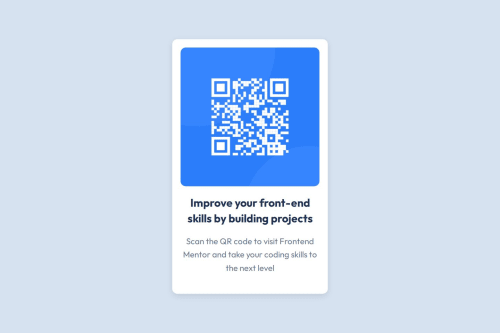
Design comparison
Solution retrospective
I’m most proud of creating a responsive design that works well for both mobile and desktop views, ensuring a clean and polished layout. The CSS, particularly the mobile-first approach, came together nicely and gave me confidence in handling basic responsiveness. Next time, I’d like to experiment with more complex CSS techniques, such as animations or advanced grid layouts, to push my skills further.
What challenges did you encounter, and how did you overcome them?The biggest challenge was working with CSS and understanding how to structure the base styles while implementing responsive designs. I struggled with selecting the right properties for certain elements and ensuring consistency across breakpoints. By focusing on the fundamentals, such as Flexbox and media queries, I was able to overcome these issues step by step and gradually build the design.
What specific areas of your project would you like help with?I’d like help with improving my overall CSS, particularly in writing efficient and maintainable code. Feedback on my use of media queries and best practices for scaling designs across various screen sizes would be invaluable. Additionally, I’d love suggestions for organizing CSS in a way that makes future projects faster and easier to manage.
Community feedback
- @Islandstone89Posted about 10 hours ago
Hey, good job.
Here are some changes you can apply for an even better solution:
HTML:
-
Every webpage needs a
<main>
that wraps all of the content, except for<header>
andfooter>
. This is vital for accessibility, as it helps screen readers identify a page's "main" content. Wrap the card in a<main>
. -
The alt text must also say where it leads(the frontendmentor website). A good alt text would be "QR code leading to the Frontend Mentor website."
-
I would change the heading to a
<h2>
- a page should only have one<h1>
, reserved for the main heading. As this is a card heading, it would likely not be the main heading on a page with several components.
CSS:
-
Including a CSS Reset at the top is good practice.
-
I recommend adding a bit of
padding
, for example16px
, on thebody
, to ensure the card doesn't touch the edges on small screens. -
On the
body
, changeheight
tomin-height: 100svh
- this way, the content will not get cut off if it grows beneath the viewport. -
Remove the
width
inpx
on the card. We rarely want to give a component a fixed size, as we need it to grow and shrink according to the screen size. -
We do want to limit the width of the card, so it doesn't get too wide on larger screens. To solve this issue, give the card a
max-width
of around20rem
. -
font-size
must never be in px. This is a big accessibility issue, as it prevents the font size from scaling with the user's default setting in the browser. Use rem instead. -
Paragraphs have a default value of
font-weight: 400
, so there is no need to declare it. -
On the image, add
display: block
,height: auto
and changewidth
tomax-width: 100%
- the max-width prevents it from overflowing its container. Without this, an image would overflow if its intrinsic size is wider than the container.max-width: 100%
makes the image shrink to fit inside its container. -
As the design doesn't change, there is no need for any media queries. When you do need them, they should be in
rem
orem
, notpx
.
0 -
- @PatLattingPosted about 12 hours ago
I like the look of your code, the structure appears to be readable. I did observe that your solution does seems to have a card component that is a bit bigger than the design. Adjusting the size of the QR code image might correct this. You may also consider changing the size of margins or padding. These suggestions may help to reduce the size of the card component.
0
Please log in to post a comment
Log in with GitHubJoin our Discord community
Join thousands of Frontend Mentor community members taking the challenges, sharing resources, helping each other, and chatting about all things front-end!
Join our Discord