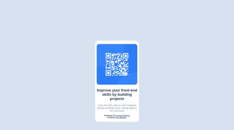
Design comparison
SolutionDesign
Solution retrospective
##First project. qr-code-component-main.
Please tell me how I can improve. My biggest challenge was Layout and Positioning: especially positioning of the QR code component. I finally managed by following the CSS Flexbox guide.
Community feedback
- @ZubairAbid101Posted over 1 year ago
Hello!!! 👋
Congratulations on completing the challenge! 🎉
There are some things that you can improve in the code,
- Instead of using the
<section>element, use the<main>element instead since the<section>element is preferably used when there are multiple sections on a single webpage. Since this is a simple design with only one component a<main>element will suffice. - Give the
<body>element amin-height: 100vh. This will cause thealign-item: centerandjustify-content: centerto work properly making the component be at the center dynamically. - Another change that can be made is that for mobile layout don't give the
<body>element a fixed width. Instead set the<section>element to a width relative to the viewport size by doingwidth: 90vw. Also don't specify the height of the<body>element as a fixed value instead let the component occupy as much height as it needs to.
I hope you find this comment helpful! 🙂
Did you know that there's a mark as helpful and an up-vote option? 🤔
There's even a Follow button!!! 😁
Happy Coding!!! 💻
Marked as helpful1 - Instead of using the
Please log in to post a comment
Log in with GitHubJoin our Discord community
Join thousands of Frontend Mentor community members taking the challenges, sharing resources, helping each other, and chatting about all things front-end!
Join our Discord
