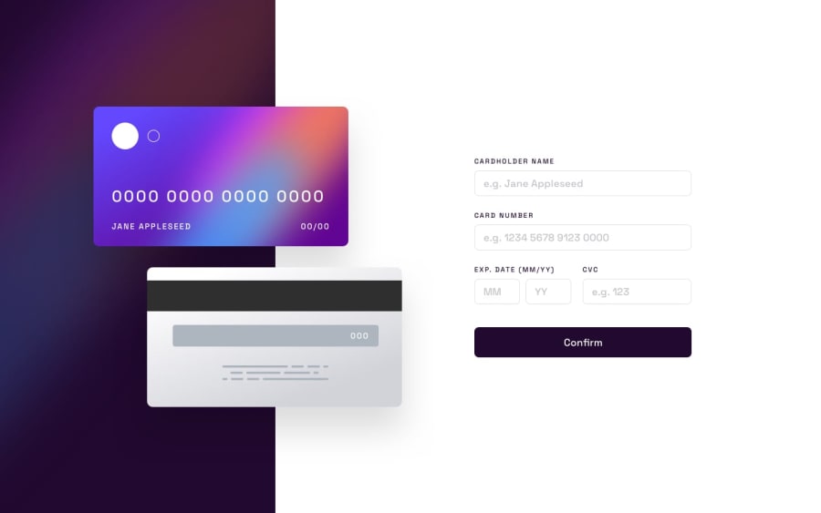
HTML5, CSS, and jQuery for Interactive Card
Design comparison
Solution retrospective
This challenge took me quite A LOT of effort.
A difficulty I ran into was the layout of the form. Particularly, the expiration portion being grouped together. When running the error label the padding of a valid expiration would interfere with the invalid causing the error to be pushed further down. I used a CSS class called 'semi-valid' to mark when a group of inputs is partially valid to fix that particular issue. I am unsure if this is the best way to handle that issue.
Another difficulty was the validation, doing that by hand is very tedious process. I ended up using jQuery Validation Plugin to do the heavy lifting and it did an excellent job.
Finally, formatting the credit card number input to automatically add a whitespace in groups of 4 was tricky. You have to pay attention to the cursor position as you edit the value of the input.
Let me know if the responsiveness is lacking. I went through the debugger on Google Chrome to test out different screen sizes. Any suggestion are welcome!
Community feedback
- @NaleekaPosted over 2 years ago
The month input must have a custom validation with JavaScript (or Jquery) , It takes even bigger numbers like 23
You could do something like this =>
      confirmBtn = document.querySelector("form buttom");

confirmBtn.addEventListener("click", (e)=> {
    e.preventValue()
    checkMonth()
}

function checkMonth(){
     if(month.value && month.value > 0 && month.value <= 12){
      // the solution goes here,
      }
}
your project look exactly like the design love your work <3
Marked as helpful2 - @mattari97Posted over 2 years ago
Hi Daniel. Nice work and i think you did a great job with the layout because it is very close to the design.
There is a little fix for the card number on the front card.
The card number is center aligned but it should be left aligned like on the design (always aligned with the card logo & the Name). It works with all 0 but since each character has a different length it is not consistent.
here is the fixed code i tested on the browser:
{
  position: absolute;
  left: 2.3rem; /* fix here */
  bottom: 3.4375rem;
  min-width: 27.9375rem;
  font-size: 1.625rem;
  color: var(--white);
  letter-spacing: 0.25rem;
  text-align: center; /* remove this line */
  text-decoration: none;
}
Again, great job and happy coding.
Marked as helpful2
Please log in to post a comment
Log in with GitHubJoin our Discord community
Join thousands of Frontend Mentor community members taking the challenges, sharing resources, helping each other, and chatting about all things front-end!
Join our Discord
