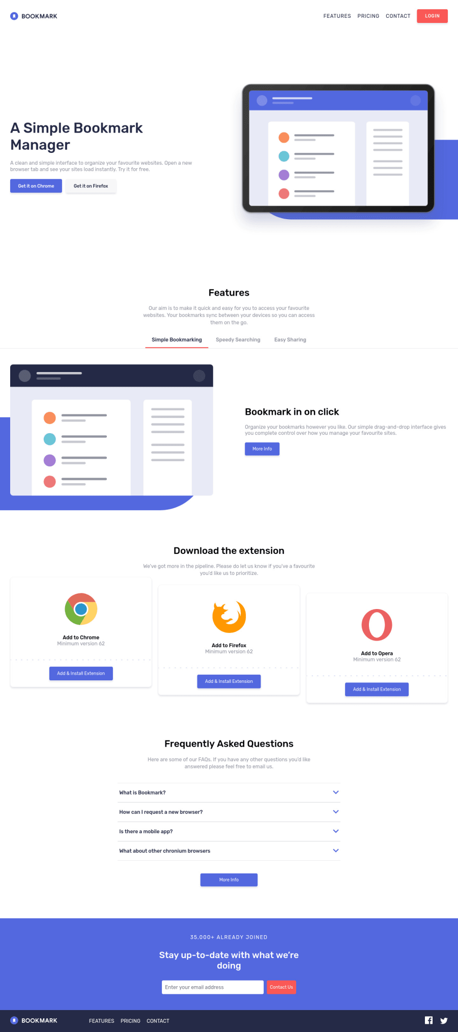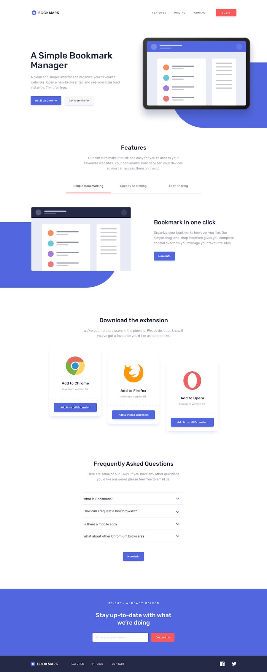
Design comparison
SolutionDesign
Solution retrospective
Just completed this and didn't do it in a good state of mind, might have many errors, I will like to get feedback from it
Community feedback
Please log in to post a comment
Log in with GitHubJoin our Discord community
Join thousands of Frontend Mentor community members taking the challenges, sharing resources, helping each other, and chatting about all things front-end!
Join our Discord
