Not Found
Not Found
Not Found
Not Found
Not Found
Not Found
Not Found
Not Found
Not Found
Not Found
Not Found
Not Found
Not Found
Not Found
Not Found
Not Found
Not Found
Not Found
Not Found
Not Found

Submitted

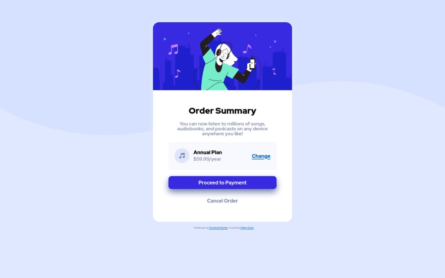
HTML5 and CSS3 desktop solution for the Order Summary Page.

Felipe 10

@felipe-goes

Desktop design screenshot for the Order summary component coding challenge

This is a solution for...

  • HTML
  • CSS
1newbie
View challenge

Design comparison


SolutionDesign

Solution retrospective


Hello everyone. Please feel free to give me any feedbacks. I do not have much experience so I would like to have some tips on the best practices and how to make the page responsive. Thank you all.

Community feedback

@purple-mountain

Posted

It does not look good on mobile devices. When you were setting width to card class, you should have used max-width property instead of just width. You should also try using background-image property for images.

Marked as helpful

0
Beeching 45

@Beeching

Posted

Hey, this is a good first solution, good job!!

One thing I'm noticing is it looks a lil bit "squished", the main reason being the card-summary <p> line height. Try adjusting the line-height for it in your css, you'd be surprised how much of a difference small things like that can make! I have found that 26px seems to work nicely in your solution.

One more thing, try to avoid setting the font-size in px. Pixels are considered bad practice for accessibility reasons, it overrides the browsers default settings which can impact people who have adjusted their browsers default font-size. You don't need to overwhelm yourself with all of the different units just yet, but it wont hurt to read about them. What I would suggest to start with is to set your font-sizes in "rem"s rather than "px"s.

There are a lot of videos on youtube explaining REMs and other relative css units! feel free to check them out when you get some free time. Have a good day, keep it up :)

Marked as helpful

0

@benjoquilario

Posted

Hi felipe-goes

Great job on finishing this one. It's really great even though you didn't use flexbox or grid. It still responsive. But I suggest you to learn Flexbox and Grid both are useful for creating a complex webpage and both are good for creating a responsive webpage.

  • First learn Flexbox then practice, practice and practice.

keep coding and goodluck!

Marked as helpful

0

Please log in to post a comment

Log in with GitHub
Discord logo

Join our Discord community

Join thousands of Frontend Mentor community members taking the challenges, sharing resources, helping each other, and chatting about all things front-end!

Join our Discord