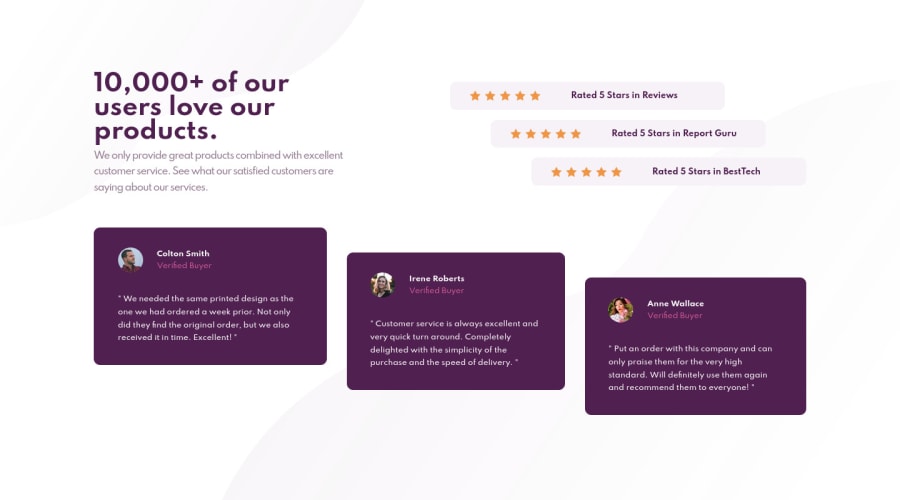
Design comparison
SolutionDesign
Solution retrospective
In this challenge I got to use a lot of grid and flexbox for positioning and honestly I learned quite a bit about grid. It's something I haven't really used much up to this point and it was interesting to make a layout using it.
Community feedback
Please log in to post a comment
Log in with GitHubJoin our Discord community
Join thousands of Frontend Mentor community members taking the challenges, sharing resources, helping each other, and chatting about all things front-end!
Join our Discord
