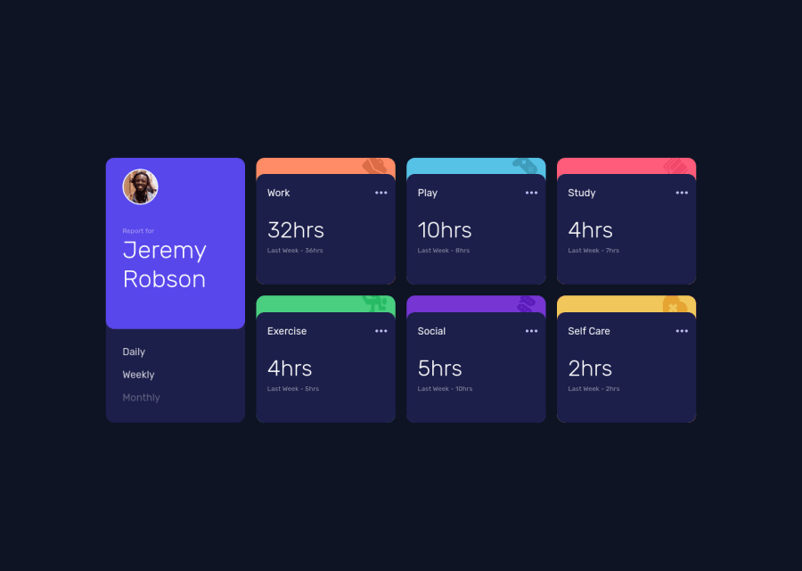
Html y CSS - Grid Layout y Flexbox
Design comparison
Solution retrospective
Hi!!, I'm just trying to improve my css skills. I'd like to know if I did it correctly or if there was a better way to do it
Thanks
Community feedback
- P@kens-visualsPosted over 3 years ago
Hey @carlosedugoc 👋🏻
I have some suggestions to help you fix the accessibility issues and some other things.
- In your markup,
<div class="container">...</div>should be<main class="container">...</main>and this will fix the accessibility issues. Don't forget to generate a new repot once you fix the issues. - Next, make sure to add
alttext, in this case it should look like this:
<img src="./images/image-jeremy.png" alt="Jeremy Robson">- I won't go into details about resetting CSS, but I'll leave this cool article here, which will make more sense than my brief explanation.
- You've named the classes good enough, but if you're trying to boost productivity and improve CSS, I'd suggest learning BEM convention.
- Also, I suggest implementing
:hoverstate on ellipsis, which you can find in design folderactive-stateimage, after you implement it you can also addtransition: all 0.2s;to the boxes and ellipsis, this will make:hoversmoother.
I hope this was helpful 👨🏻💻 other than that, you did a great job, keep it up. Cheers 👾
Marked as helpful0@carlosedugocPosted over 3 years ago@kens-visuals Thank you very much Ken. I will take in mind your comments for my next css projects.
0P@kens-visualsPosted over 3 years ago@carlosedugoc you're welcome 😇 I'd really appreciate if you could mark the comment as helpful 🙃
0 - In your markup,
Please log in to post a comment
Log in with GitHubJoin our Discord community
Join thousands of Frontend Mentor community members taking the challenges, sharing resources, helping each other, and chatting about all things front-end!
Join our Discord
