Design comparison
Solution retrospective
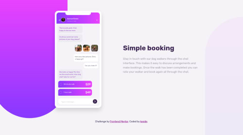
please i need to know how bad this is?
Community feedback
- @AgataLiberskaPosted over 3 years ago
Hi @kcde, I don't think it's bad at all, but I'm not a fan of the delay before the first animation, I thought something was broken.
The only other things that I noticed is that on mobile screens, the text stretches right to the edges, it could use some padding. I would also make sure that the background color is as shown in the design, and double check font-sizes - 9px is really small!
Hope this helps, and don't put yourself down, you've done well!
0@kcdePosted over 3 years ago@AgataLiberska thanks.... I'll fix the padding on mobile screens. I totally forgot about that. And about the background color, I was really confused (i still am). I don't know if they should be white or the color I went for.
About the 9px, do you mean the messages? because anything more than 9px just looks weird on the phone.
0@AgataLiberskaPosted over 3 years ago@kcde yeah I meant the messages on the phone, they seem a bit small to me, but I haven't done this challenge myself and I'm not familiar with the design, so I might be wrong :)
About the background - there's a difference when you look at the comparison above, yours is a bit darker. I think the background in the design is some kind of grayish/cream color? The darker background doesn't look bad but it affects the contrast, so some users may struggle to read it.
0
Please log in to post a comment
Log in with GitHubJoin our Discord community
Join thousands of Frontend Mentor community members taking the challenges, sharing resources, helping each other, and chatting about all things front-end!
Join our Discord