Design comparison
Solution retrospective
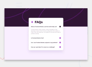
What I'm most proud of in this accordion project is how smooth and interactive it feels, especially with modern CSS techniques like clamp() and transitions. If I were to do it again,
What challenges did you encounter, and how did you overcome them?One of the main challenges I encountered was ensuring the accordion worked consistently across different screen sizes while maintaining smooth transitions.
What specific areas of your project would you like help with?I would focus more on improving accessibility by adding ARIA attributes for better screen reader support.
Community feedback
- @YacoubDweikPosted about 1 month ago
Hey Kristy! well done! I just want you to know that this way if I open a question it would not close others you know why? cuz simple you need to give all details elements an attr called name, then you have to call all of them tby the same name and that's how they became linked together, keep it up!
0 - @bharatkumar02Posted about 1 month ago
Your Design is perfect but border appears on your whole heading when I click on buttons.
0
Please log in to post a comment
Log in with GitHubJoin our Discord community
Join thousands of Frontend Mentor community members taking the challenges, sharing resources, helping each other, and chatting about all things front-end!
Join our Discord
