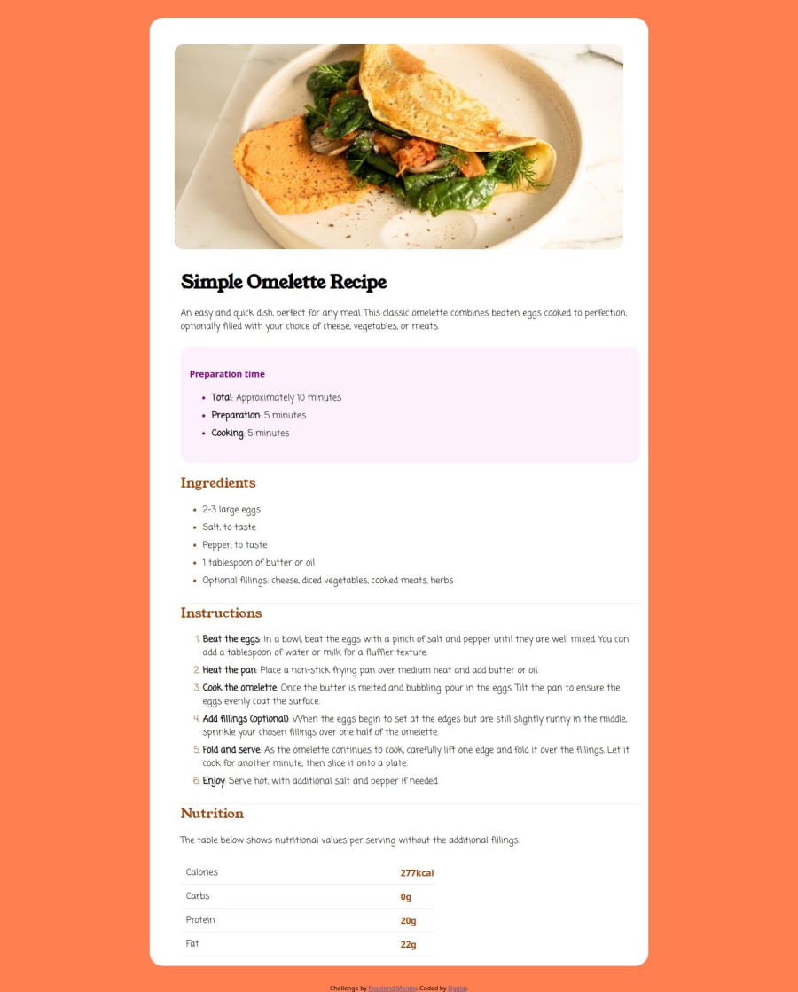
Design comparison
Solution retrospective
I aimed to build a dynamic recipe menu, focusing on creating a clean and easy-to-use interface for users to browse, search, and filter various recipes. The goal was to design something visually appealing, yet functional, where users could explore different recipes and get detailed instructions with minimal effort.
What challenges did you encounter, and how did you overcome them?I faced challenges with handling large datasets for recipes, optimizing image loading, and ensuring responsive design across devices. To overcome these, I implemented pagination, image compression, and used Flexbox/Grid for layout flexibility. Improving search performance through debouncing and enhancing accessibility with semantic HTML
What specific areas of your project would you like help with?I’d appreciate help with optimizing performance when filtering large datasets of recipes in real-time. Feedback on further improving image loading speeds and handling media efficiently would also be valuable. Additionally, advice on enhancing accessibility features and structuring a more scalable CSS codebase would be helpful.
Community feedback
- @NathanGeovanePosted about 2 months ago
Would be nice if you could change the background color to the right color and also make the padding of the card even, because there is more white space on the left
0
Please log in to post a comment
Log in with GitHubJoin our Discord community
Join thousands of Frontend Mentor community members taking the challenges, sharing resources, helping each other, and chatting about all things front-end!
Join our Discord
