Design comparison
Solution retrospective
I initially used the class 'container' but I was not able to get a different background color for the qr code box and so used the class 'card'. I also found using box was not allowing the background color show on the block. I feel I could have still used either of these two though...pls tell me how?
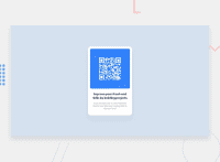
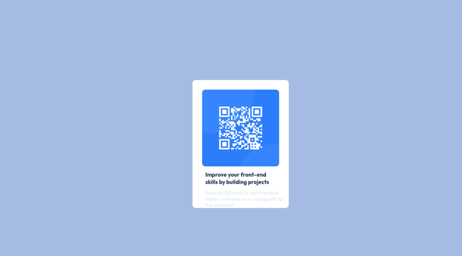
This is my attempt without looking at any other solutions to this challenge because I wanted to achieve this solution all by myself. I know it is not an exact replica of the design and welcome best practises solutions to be shared with me.
Community feedback
- @codewithpedroPosted over 2 years ago
Hi Titilola,
First congrats on your first challenge. You have the majority of the components for the challenge: a card background, the qr image, and the text. You did an amazing job for your first try.
Here are some tips you can follow to refactor your code.
First, your main tag should be outside the qr-code div. The main element is usually the element representing the dominant content which means it should be outside your div because the whole card is the main area for the challenge.
Second, let’s talk about naming convention and when to use general div tags. At the moment you have three div tag. qr-card, qr-code, and qr-text, these are great starting tags but you can remove one of the tag which is qr-code. It’s not necessarily needed because there isn’t any css needed for the div. Also let’s give a class name to the image, let’s say qr-img. Therefore you can replace img with qr-img.
So you should have something like this
<main>
    <div class="qr-card">
            <img class="qr-img" src="image-qr-code.png", alt="the QR code image">

            <div class="qr-txt">
            </div>
    </div>
</main>
Third the css. Let’s start with the image. I would suggest giving the image a display of block. This will allow the image to be affected by margin and other properties including the parent. This will allow us to use the margin-inline property (similar to margin-right and margin-left), set this to auto to let the img center inside the qr-card. You should have the following in the css
.qr-img {
	display: block;
	margin-inline: auto;
	width: 80%;
        border-radius: 10px;
}
Lastly, centering text. To center the text is very simple just add text-align: center to your .qr-card.
.qr-card {
	text-align: center;
}
Hopefully these tips can help with your code refactoring. Happy coding!
0@titiodusPosted over 2 years ago@jovanydev
Thank you for your very detailed feedback.
Trying out your suggestions really changed my design output but I am taking it as another challenge to understand what I need to do to arrive at making my design as close to the challenge's as much as possible.
0 - @JexintePosted over 2 years ago
Hello @titiodus ,
You've done a good job on this one the fact it's not the exact replica isn't a problem you can try another shot later if you feel more comfortable and you finish it that is one of the most important point .
Could you be more specific about your problem with the class .container ?
Perhaps I haven't clearly understand what you said about using box but can you rephrase it ?
So I checkout the report and you have 2 minors errors and here what you can do about it :
-
You can replace <h3> tag by <h1> on the title ( It's recommanded to have on h1 per page) more details here on headings : https://developer.mozilla.org/en-US/docs/Web/HTML/Element/Heading_Elements
-
On you <img> you have a comma and it's not allowed on the tag so just remove it and update your solution and you'll be fine
Perhaps there is others advice that can be related by others ( I'm beginner too)
In hope it helps
0@titiodusPosted over 2 years ago@Jexinte Thank you for your feedback.
I have removed the comma in my <img> but didnt do the <h3> change coz I didnt know that was what was required. I do that now.
Cheers
0 -
Please log in to post a comment
Log in with GitHubJoin our Discord community
Join thousands of Frontend Mentor community members taking the challenges, sharing resources, helping each other, and chatting about all things front-end!
Join our Discord

