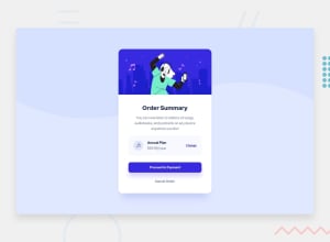
Design comparison
Solution retrospective
The challenge, makes me love coming for more challenges. Well i'll say being able to design something close to the original design means that am getting closer to being perfect. I try to be exact next time i mean with the U/I.
What challenges did you encounter, and how did you overcome them?Actually adding the background image was a bit strange cos it's my first time of coming across it, am familiar with the normal background color, but not image , but am happy i found a way around it.
What specific areas of your project would you like help with?I need an honest overall review.
Community feedback
- @Harsh-Kumar-DwivediPosted 8 months ago
Hi @Valchali ,
Nice Solution !
I would suggest following:-
1.Add space and more border radius to the plan pricing section, You can prefer following:-
.icon-music {
    padding: 15px;
    border-radius: 13px;
}
2.Prefer changing
margin-lefttomargin-rightiniconclass.3.Try implementing active states and in that try using
opacityCSS property for the required effect.4.Once you are done with your solution, try to go through your code in order and spot the difference, they try eliminating the difference and it loops until the required design is achieved.
5.Feel free to ask community for suggestions, improvements and help.
Hope these suggestions are helpful !
Stay Happy & Healthy !
Happy Coding !
Marked as helpful1
Please log in to post a comment
Log in with GitHubJoin our Discord community
Join thousands of Frontend Mentor community members taking the challenges, sharing resources, helping each other, and chatting about all things front-end!
Join our Discord
