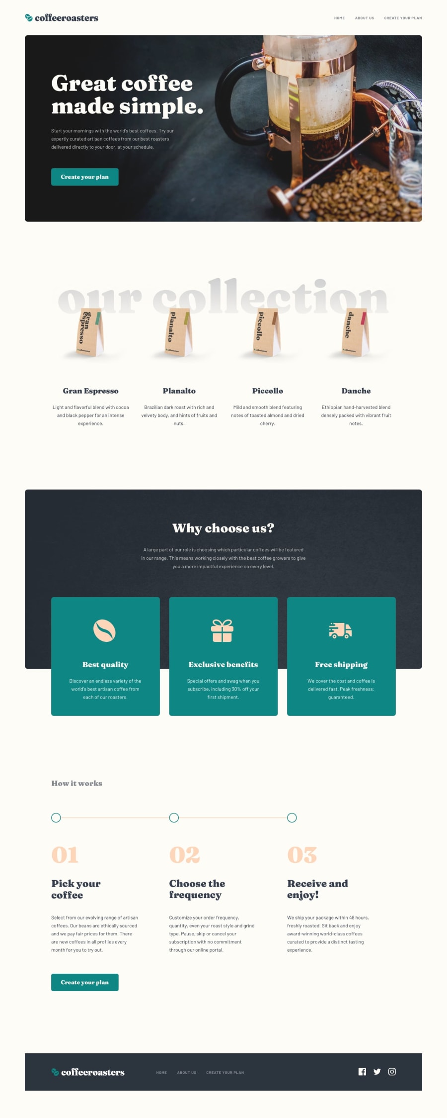
Design comparison
Community feedback
- @yunus-ujjainiPosted over 3 years ago
Hi Agata.
I went through most of your solutions they are all really nice. One thing I noticed In this solution - after creating a plan we get the checkout modal in which if we press and hold the checkout button, the price from the left corner is sliding over to the right side.
Happy coding :)
1@AgataLiberskaPosted over 3 years ago@yunus-ujjaini oh that is weird, thanks for spotting that! Any idea why this is happening? :D
0 - @DrKlonkPosted over 3 years ago
Hi Agata,
Nice solution! Good to read (in your readme) that using a framework would do nicely here, especially with the reusable components. I fully agree! It is well worth picking up one of them.
I especially like the visually hidden headers on sections for our visually impaired visitors.
Well done and happy coding! Cheers, Joran
1
Please log in to post a comment
Log in with GitHubJoin our Discord community
Join thousands of Frontend Mentor community members taking the challenges, sharing resources, helping each other, and chatting about all things front-end!
Join our Discord
