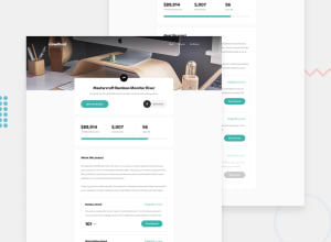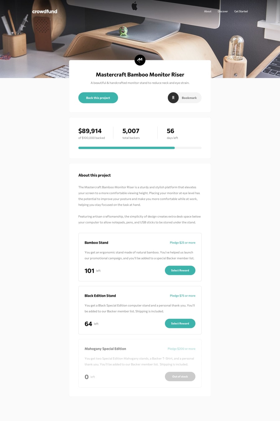
Design comparison
SolutionDesign
Solution retrospective
Still have some bugs, working on them.
Hope you like it. feedback would be appreciated.
Thanks
Community feedback
- @christopher-adolphePosted over 2 years ago
Hi @Alucard2169,
You have done a good job overall. 👍 Here are a few things that I have noticed and you might want to check in order to improve your solution.
HTML:
- The
<div>elements formain-card,stats-cardandabout-cardcould be replaced by<section>elements for better semantic. - A
<progress>tag already exists in HTML. You could have used that instead of styling it with a<div>. It will make thing easier to manage when the progress is dynamic. Read more here - You really don't need a separate main navigation for mobile. You can use the same markup and adjust the styles using media queries.
- The modals are missing a backdrop. This will prevent users from interacting with other elements of the page because at the moment users can see both the
Thanks for your support!andBack this project. You could refactor the html code for the modal like this:
<div class="modal">
  <div class="modal__container">
    <div class="modal__content">
      <div class="modal__header">
      </div>

      <div class="modal__body">
      </div>

      <div class="modal__footer">
      </div>
    </div>
  </div>
</div>
.modal { position: fixed; top: 0; left: 0; display: flex; justify-content: center; align-items: center; width: 100%; height: 100vh; overflow-x: hidden; overflow-y: auto; background-color: rgba(0, 0, 0, 0.15); z-index: 1000; }SCSS:
- Since you are using Sass, try to move the styles for different components in dedicated files (a.k.a partials) and then import them in your
styles.scssfile. This will help keep your stylesheet more readable and maintainable in the long run. - Keep an eye on the level of nesting of your css selectors. Deeply nested selectors lead to overly specific and less reusable rules which are too reliant on the HTML structure. At the moment, most of your selectors are dependent on the
<main>element. Try to keep the nesting to a maximum of 3 levels deep.
JS:
- Maybe you should consider to reset the form in the
Back this projectmodal after the user has entered a pledge amount and has clicked onContinue.
Hope this helps.
Keep it up.
Marked as helpful1@Alucard2169Posted over 2 years ago@christopher-adolphe Wow, thanks a lot for this. This will not just help me in this project but in the future too. 😊😊Thanks a lot.
0@christopher-adolphePosted over 2 years ago@Alucard2169 I'm happy to help.
Best regards.
1 - The
Please log in to post a comment
Log in with GitHubJoin our Discord community
Join thousands of Frontend Mentor community members taking the challenges, sharing resources, helping each other, and chatting about all things front-end!
Join our Discord
